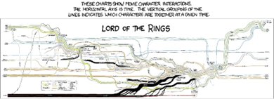
I’ve noticed there are many research papers regarding storyline visualizations. Storyline visualizations all stem from this sketch of Randall Munroe’s movie narrative charts:
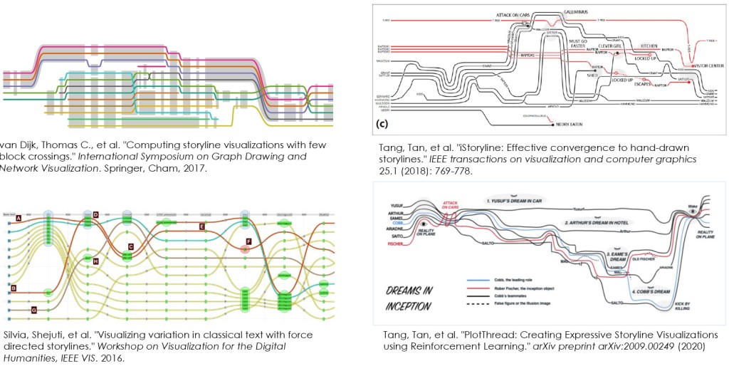
Various researchers have incrementally pushed this idea forwards, algorithmically generating the chart, optimizing the layout of the chart, etc. Here’s a few:
But why storylines? What’s the point of adopting Randall’s sketch and automating it? What’s the storyline do well, and why use it? There are various problems with storylines, for example:
1. Implied presence. The consistency of all lines over time implies all characters are treated equally throughout the narrative. Most narratives focus on a couple characters, others are supporting characters which occur less frequently in the narrative. Why are their lines solid during the time when they are not present in the narrative?
2. Flashbacks. Storylines plot time on the x-axis, but what time? Typically it’s some absolute time, so how do flashbacks fit into a timeline? Or worse, time travel (Looper? Tenet?)
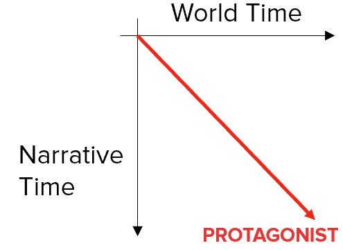
I’ve been critical of storyline visualizations for a while. If time is important, then one should consider differentiating between world-time vs the narrative sequence. In a simple linear story, the two are the same:
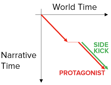
We can then show a jump in time across scene-cuts as a world-time gap, but not a narrative time gap. Characters can exist in only certain scenes, such as the introduction of a side-kick:
Here’s a sketch of a simplistic story with a hero, a side-kick and a villain. We’re first introduced to the protagonist, who is joined thereafter by a sidekick. We then go back in world-time with a flashback to show some defining event in the hero’s backstory, then jump back to the present time where the hero and sidekick embark on their quest. Meanwhile, at the same worldtime, we are introduced to the villain. All three characters meet, there’s some kind of conflict scene, the villain is defeated and disappears from the timeline and the hero and sidekick celebrate:

Seems interesting. Would it work with real data? Here’s a sketched version based on the first two episodes of One Piece (2023 live action on Netflix):
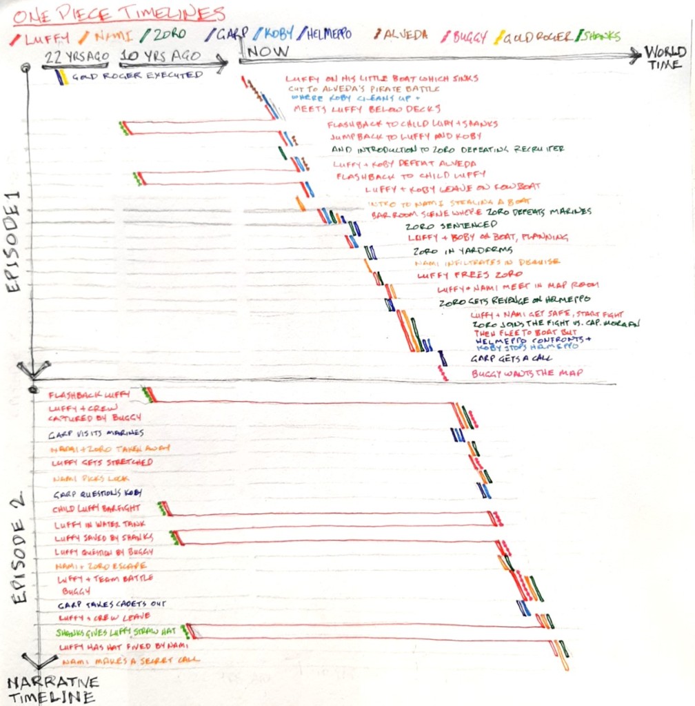
Is it useful? It helped me understand story structure: characters, scenes, activities and flashbacks. Also, it indicates a bit of content regarding each scene, e.g. Luffy + crew captured by Buggy, Garp visits marines, Nami + Zoro taken away, etc. It might be more useful for a time travel movie like Tenet, where you’d see lines progressing first forwards-sloping diagonal, then along the backwards diagonal through the same scenes such as aircraft crashes and highway chase scenes (which then can be represented as vertical bands).
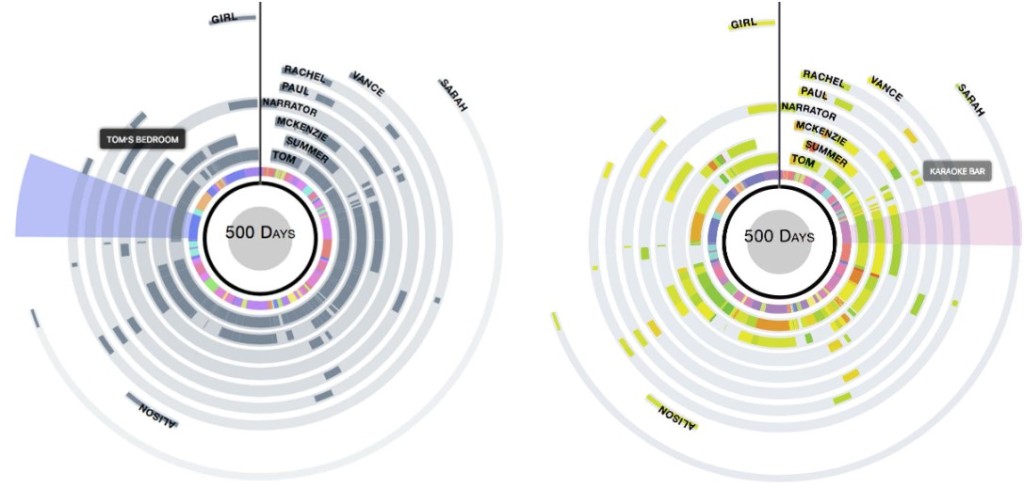
More generally, it helps raise the question of what we could or should be visualizing when we are trying to visualize a story. Here’s an interesting paper from IUI 2019 called StoryPrint by Katie Watson et al. The authors looked at all the storyline visualizations, then made something different. It’s a a radial visualization with time proceeding clockwise, scenes as wedges, and character arcs (literally). The arcs can then augmented with useful information such as a character speaking a line of dialogue (left), or character emotion (right).
Of course, there’s much more possible. Both StoryPrint and the World-time/Narrative-time visualizations provide a bit more context. Yet, there are wonderful historical visualizations that weave in much more content directly into representation. Here’s a few images to inspire future storyline visualizations:

History of Political Parties, 1894. Gradient colors, line labels, annotations, line splits and merges…

Tableau De L’Histoire Universelle, 1858. Multiscale text, aligned annotated tracks…

Carte des origines inventions et decouvertes, 1830. Wonderfully maximizing text.
