Energy
Mapped: Every Power Plant in the United States
This Map Shows Every Power Plant in the United States
Every year, the United States generates 4,000 million MWh of electricity from utility-scale sources.
While the majority comes from fossil fuels like natural gas (32.1%) and coal (29.9%), there are also many other minor sources that feed into the grid, ranging from biomass to geothermal.
Do you know where your electricity comes from?
The Big Picture View
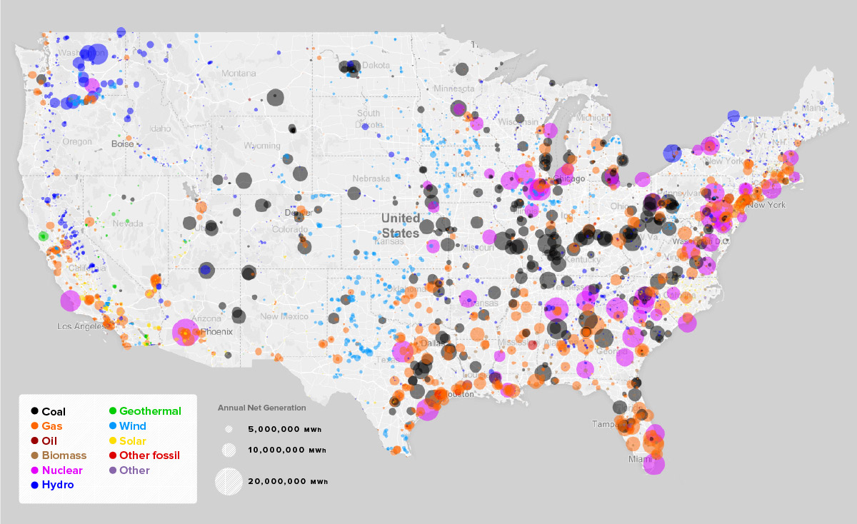
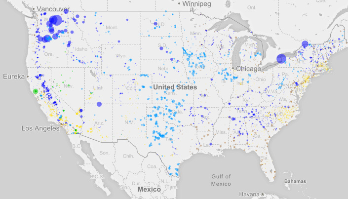
Today’s series of maps come from Weber State University, and they use information from the EPA’s eGRID databases to show every utility-scale power plant in the country.
Use the white slider in the middle below to see how things have changed between 2007 and 2016:
The biggest difference between the two maps is the reduced role of coal, which is no longer the most dominant energy source in the country. You can also see many smaller-scale wind and solar dots appear throughout the appropriate regions.
Here’s a similar look at how the energy mix has changed in the United States over the last 70 years:
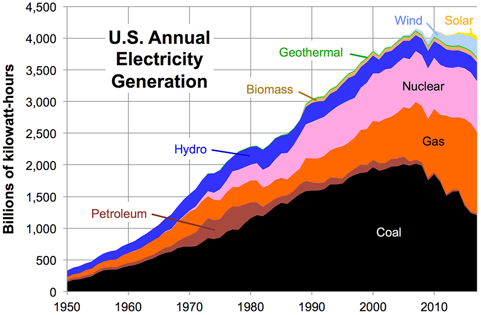
Up until the 21st century, power almost always came from fossil fuels, nuclear, or hydro sources. More recently, we can see different streams of renewables making a dent in the mix.
Maps by Source
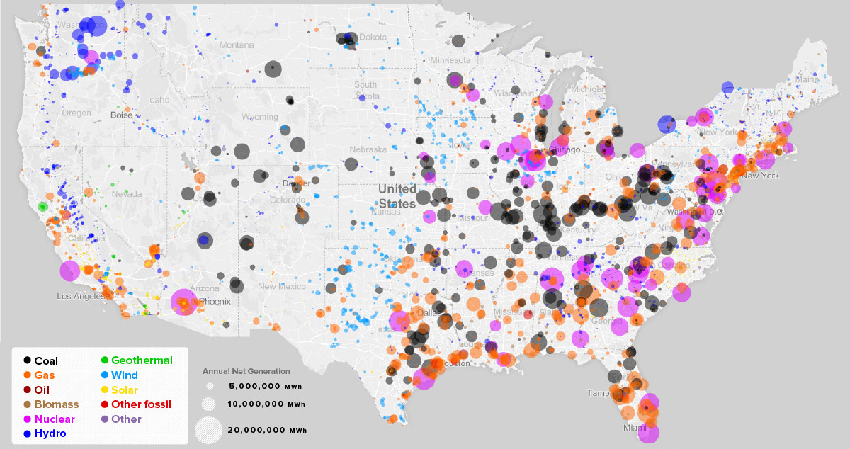
Now let’s look at how these maps look by individual sources to see regional differences more clearly.
Here’s the map only showing fossil fuels.
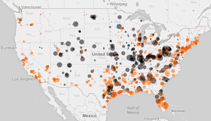
The two most prominent sources are coal (black) and natural gas (orange), and they combine to make up about 60% of total annual net generation.
Now here’s just nuclear on the map:
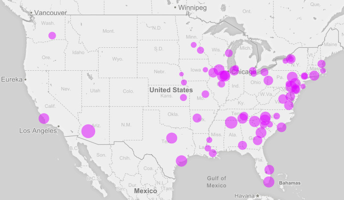
Nuclear is pretty uncommon on the western half of the country, but on the Eastern Seaboard and in the Midwest, it is a major power source. All in all, it makes up about 20% of the annual net generation mix.
Finally, a look at renewable energy:
Hydro (dark blue), wind (light blue), solar (yellow), biomass (brown), and geothermal (green) all appear here.
Aside from a few massive hydro installations – such as the Grand Coulee Dam in Washington State (19 million MWh per year) – most renewable installations are on a smaller scale.
Generally speaking, renewable sources are also more dependent on geography. You can’t put geothermal in an area where there is no thermal energy in the ground, or wind where there is mostly calm weather. For this reason, the dispersion of green sources around the country is also quite interesting to look at.
See all of the above, as well as Hawaii and Alaska, in an interactive map here.


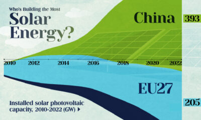

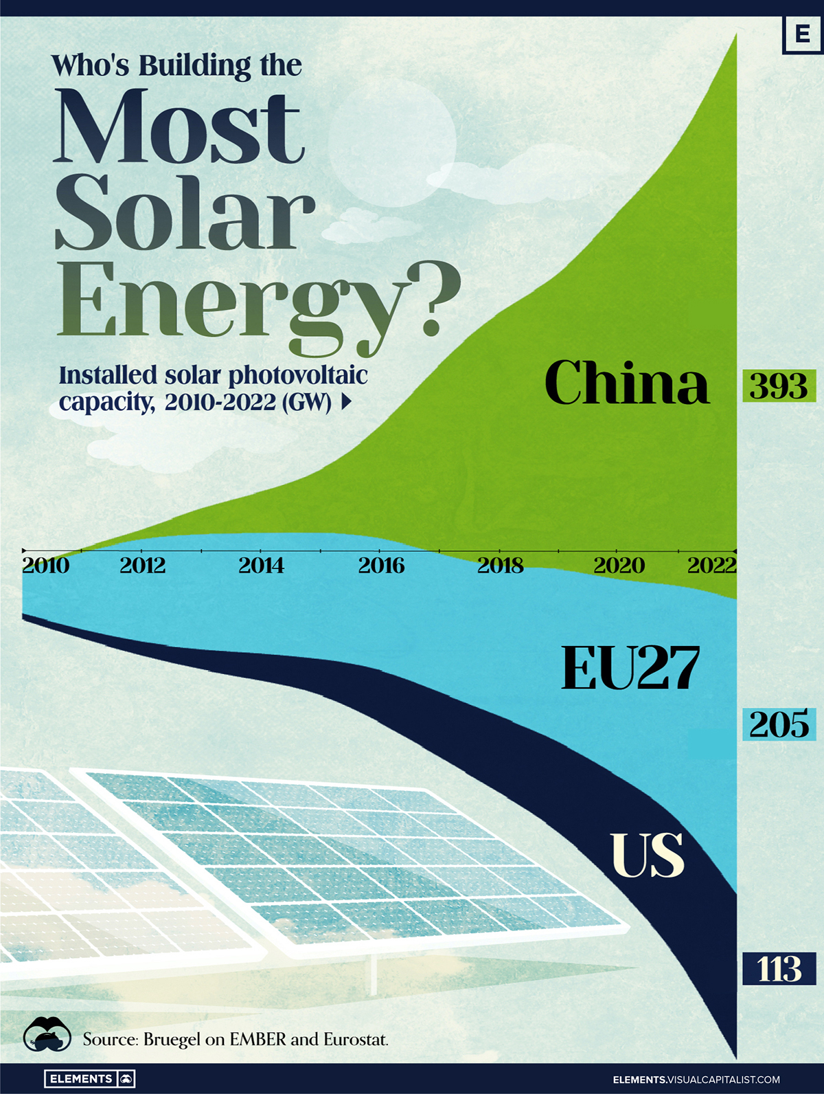
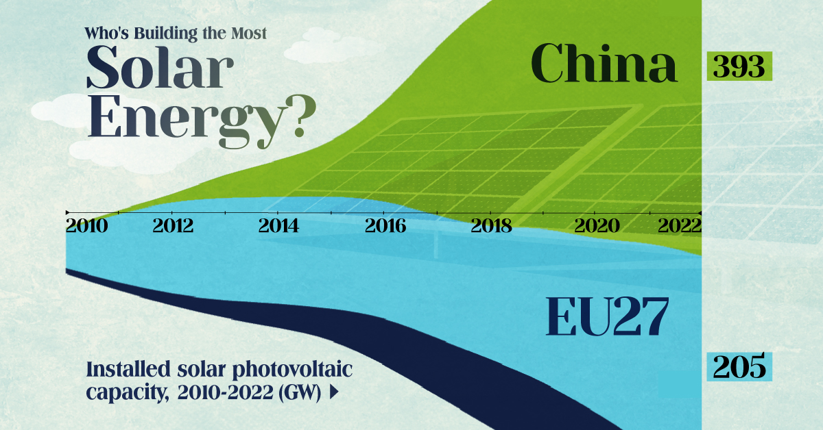
Who’s Building the Most Solar Energy?
This was originally posted on our Voronoi app. Download the app for free on iOS or Android and discover incredible data-driven charts from a variety of trusted sources.
In 2023, solar energy accounted for three-quarters of renewable capacity additions worldwide. Most of this growth occurred in Asia, the EU, and the U.S., continuing a trend observed over the past decade.
In this graphic, we illustrate the rise in installed solar photovoltaic (PV) capacity in China, the EU, and the U.S. between 2010 and 2022, measured in gigawatts (GW). Bruegel compiled the data..
Chinese Dominance
As of 2022, China’s total installed capacity stands at 393 GW, nearly double that of the EU’s 205 GW and surpassing the USA’s total of 113 GW by more than threefold in absolute terms.
| Installed solar capacity (GW) | China | EU27 | U.S. |
|---|---|---|---|
| 2022 | 393.0 | 205.5 | 113.0 |
| 2021 | 307.0 | 162.7 | 95.4 |
| 2020 | 254.0 | 136.9 | 76.4 |
| 2019 | 205.0 | 120.1 | 61.6 |
| 2018 | 175.3 | 104.0 | 52.0 |
| 2017 | 130.8 | 96.2 | 43.8 |
| 2016 | 77.8 | 91.5 | 35.4 |
| 2015 | 43.6 | 87.7 | 24.2 |
| 2014 | 28.4 | 83.6 | 18.1 |
| 2013 | 17.8 | 79.7 | 13.3 |
| 2012 | 6.7 | 71.1 | 8.6 |
| 2011 | 3.1 | 53.3 | 5.6 |
| 2010 | 1.0 | 30.6 | 3.4 |
Since 2017, China has shown a compound annual growth rate (CAGR) of approximately 25% in installed PV capacity, while the USA has seen a CAGR of 21%, and the EU of 16%.
Additionally, China dominates the production of solar power components, currently controlling around 80% of the world’s solar panel supply chain.
In 2022, China’s solar industry employed 2.76 million individuals, with manufacturing roles representing approximately 1.8 million and the remaining 918,000 jobs in construction, installation, and operations and maintenance.
The EU industry employed 648,000 individuals, while the U.S. reached 264,000 jobs.
According to the IEA, China accounts for almost 60% of new renewable capacity expected to become operational globally by 2028.
Despite the phasing out of national subsidies in 2020 and 2021, deployment of solar PV in China is accelerating. The country is expected to reach its national 2030 target for wind and solar PV installations in 2024, six years ahead of schedule.

-
 Markets6 days ago
Mapped: Europe’s GDP Per Capita, by Country
-

 Energy2 weeks ago
Mapped: The Age of Energy Projects in Interconnection Queues, by State
-

 Mining2 weeks ago
Visualizing Global Gold Production in 2023
-

 Markets2 weeks ago
Visualized: Interest Rate Forecasts for Advanced Economies
-

 Economy2 weeks ago
The Most Valuable Companies in Major EU Economies
-
 Markets1 week ago
The World’s Fastest Growing Emerging Markets (2024-2029 Forecast)
-
 Markets1 week ago
Visualizing Global Inflation Forecasts (2024-2026)
-

 United States1 week ago
Charted: What Southeast Asia Thinks About China & the U.S.