Money
How the Composition of Wealth Differs, from the Middle Class to the Top 1%

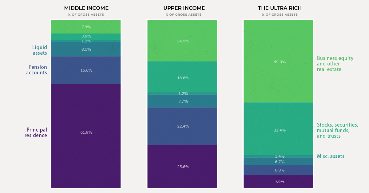
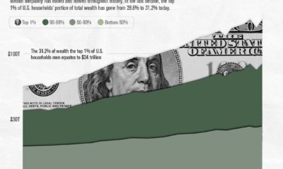
A Breakdown of Wealth, from Middle Class to the Top 1%
Just as household wealth varies greatly across the population, the composition of that wealth changes as well. Simply put, the person next to you at the grocery store will likely have a much different asset mix than, say, Warren Buffett.
Today’s chart breaks down the differences in the composition of wealth between middle income, upper income, and ultra wealthy (top 1%) of American households to help us better understand the building blocks that make up net worth. Let’s dive in.
Middle Income: Home is Where the Wealth is
It’s no surprise that the principal residence is the cornerstone of net worth for most Americans in the middle class. For households that fall in this wide range ($0 to $471k of net worth) the combination of housing and pension accounts make up nearly 80% of total wealth on average.
Assets like stocks and mutual funds only make up about 4% of wealth in this income bracket, partially mirroring the trend of lower stock market participation in recent years.
As we move up the income ladder, however, this situation changes quite a bit.
Upper Income: A Diversified Portfolio
If a household has a net worth that ranges between $471,000 and $10.2 million, it is considered to fall in the upper income band above. This represents the 20% richest households in the U.S., minus the top 1%, which are put in a separate bracket.
For this group, the principal residence makes up a smaller slice of the wealth pie. Instead, we see a higher mix of financial assets like stocks and mutual funds, as well as business equity and real estate. Almost half of households in this group own real estate in addition to their principal residence.
As households become wealthier, we tend to see a lower share of liquid assets as compared with the other components of net worth.
The Top 1%: The Business Equity Bulge
In the richest 1% of households, the principal residence makes up a mere 7.6% of assets. At this stage, almost half of assets fall under the category of business equity and real estate.
A prime example of this is Jeff Bezos. The lion’s share of the Amazon founder’s net worth is tied to the value of his company. Another example is President Trump, whose sprawling real estate empire comprises two-thirds of his estimated $3.1 billion net worth.
One of the more prominent features of the ultra rich wealth bracket is a much higher level of financial asset ownership. In fact, the top 1% of households own over 40% of stocks.
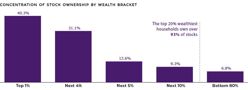
As well, this tiny group of ultra wealthy households earns 22% of total income, up from 8% in the 1970s.


Wealth
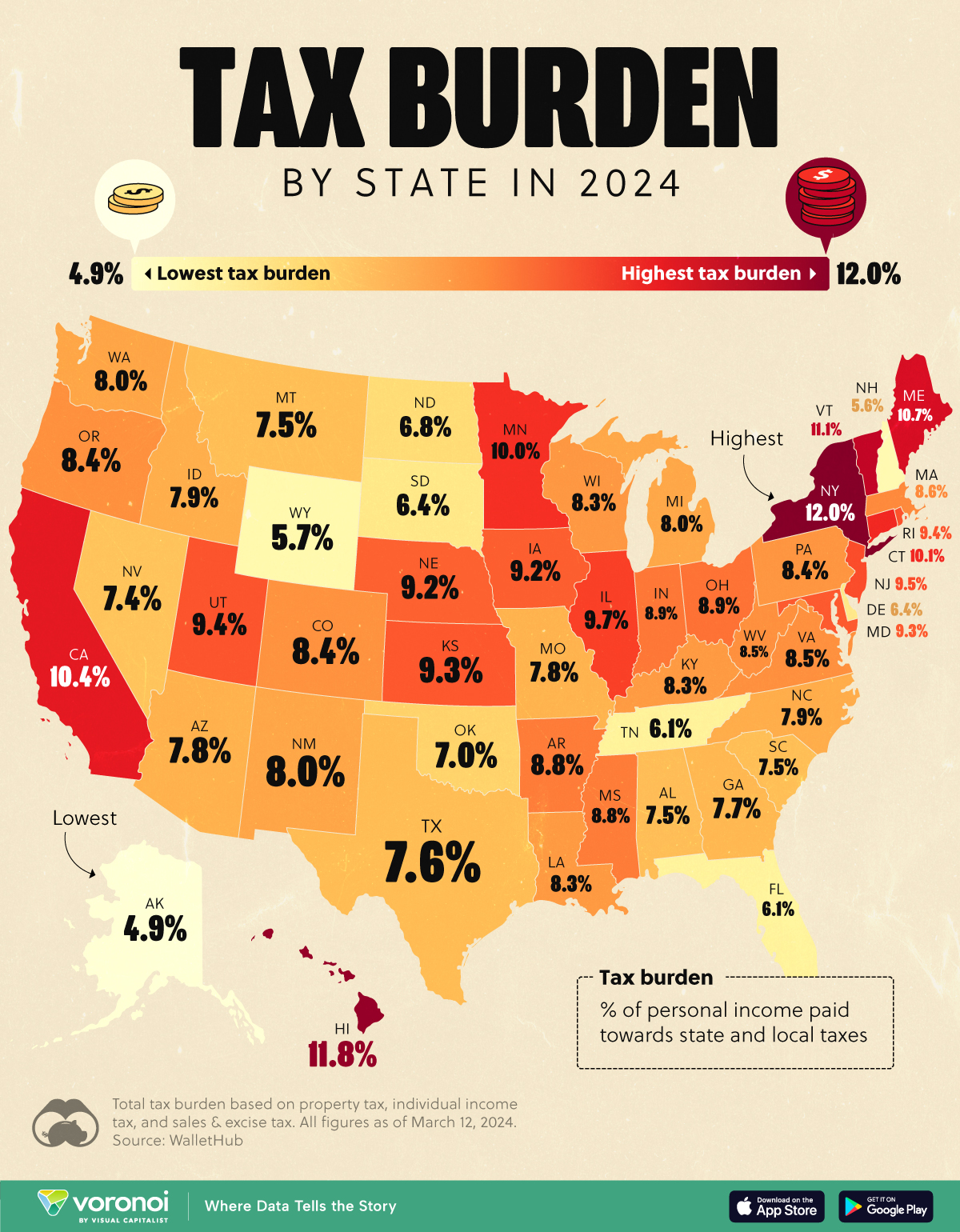
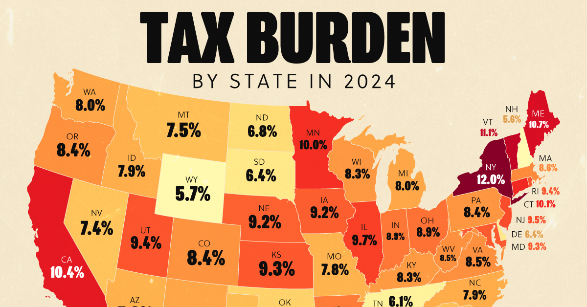
Visualizing the Tax Burden of Every U.S. State
Tax burden measures the percent of an individual’s income that is paid towards taxes. See where it’s the highest by state in this graphic.
Visualizing the Tax Burden of Every U.S. State
This was originally posted on our Voronoi app. Download the app for free on iOS or Android and discover incredible data-driven charts from a variety of trusted sources.
This map graphic visualizes the total tax burden in each U.S. state as of March 2024, based on figures compiled by WalletHub.
It’s important to understand that under this methodology, the tax burden measures the percent of an average person’s income that is paid towards state and local taxes. It considers property taxes, income taxes, and sales & excise tax.
Data and Methodology
The figures we used to create this graphic are listed in the table below.
| State | Total Tax Burden |
|---|---|
| New York | 12.0% |
| Hawaii | 11.8% |
| Vermont | 11.1% |
| Maine | 10.7% |
| California | 10.4% |
| Connecticut | 10.1% |
| Minnesota | 10.0% |
| Illinois | 9.7% |
| New Jersey | 9.5% |
| Rhode Island | 9.4% |
| Utah | 9.4% |
| Kansas | 9.3% |
| Maryland | 9.3% |
| Iowa | 9.2% |
| Nebraska | 9.2% |
| Ohio | 8.9% |
| Indiana | 8.9% |
| Arkansas | 8.8% |
| Mississippi | 8.8% |
| Massachusetts | 8.6% |
| Virginia | 8.5% |
| West Virginia | 8.5% |
| Oregon | 8.4% |
| Colorado | 8.4% |
| Pennsylvania | 8.4% |
| Wisconsin | 8.3% |
| Louisiana | 8.3% |
| Kentucky | 8.3% |
| Washington | 8.0% |
| New Mexico | 8.0% |
| Michigan | 8.0% |
| North Carolina | 7.9% |
| Idaho | 7.9% |
| Arizona | 7.8% |
| Missouri | 7.8% |
| Georgia | 7.7% |
| Texas | 7.6% |
| Alabama | 7.5% |
| Montana | 7.5% |
| South Carolina | 7.5% |
| Nevada | 7.4% |
| Oklahoma | 7.0% |
| North Dakota | 6.8% |
| South Dakota | 6.4% |
| Delaware | 6.4% |
| Tennessee | 6.1% |
| Florida | 6.1% |
| Wyoming | 5.7% |
| New Hampshire | 5.6% |
| Alaska | 4.9% |
From this data we can see that New York has the highest total tax burden. Residents in this state will pay, on average, 12% of their income to state and local governments.
Breaking this down into its three components, the average New Yorker pays 4.6% of their income on income taxes, 4.4% on property taxes, and 3% in sales & excise taxes.
At the other end of the spectrum, Alaska has the lowest tax burden of any state, equaling 4.9% of income. This is partly due to the fact that Alaskans do not pay state income tax.
Hate Paying Taxes?
In addition to Alaska, there are several other U.S. states that don’t charge income taxes. These are: Florida, Nevada, South Dakota, Tennessee, Texas, Washington, and Wyoming.
It’s also worth noting that New Hampshire does not have a regular income tax, but does charge a flat 4% on interest and dividend income according to the Tax Foundation.
Learn More About Taxation From Visual Capitalist
If you enjoyed this post, be sure to check out this graphic which ranks the countries with the lowest corporate tax rates, from 1980 to today.

-
 Politics5 days ago
Charted: What Southeast Asia Thinks About China & the U.S.
-

 Misc2 weeks ago
Visualizing the Most Common Pets in the U.S.
-

 Culture2 weeks ago
The World’s Top Media Franchises by All-Time Revenue
-

 Best of2 weeks ago
Best Visualizations of April on the Voronoi App
-

 Wealth1 week ago
Charted: Which Country Has the Most Billionaires in 2024?
-

 Markets1 week ago
The Top Private Equity Firms by Country
-

 Markets1 week ago
The Best U.S. Companies to Work for According to LinkedIn
-

 Economy1 week ago
Ranked: The Top 20 Countries in Debt to China