An effective landing page grips the visitor’s attention through copy and visuals. It imparts all the pertinent information about a brand’s service or product to the visitor with eye-catching design and stellar copy.
The best landing pages are persuasive and poignant. They are designed to beautifully communicate a brand’s value and call to action (CTA) while also increasing conversion rates and consumer engagement.
Designing high-converting landing pages is not rocket science. It may feel like rocket science; however, once you understand your brand, audience, and their pain points, you will learn how to effectively communicate and, most importantly, appeal to them.
While this process takes time, finesse, and a whole lot of practice, this article serves as a bit of ground to stand on. That said, let’s get you standing.
Here’re 31 of the best landing page examples to help drum up some inspiration and turn potential customers into high-quality leads.
31 landing page designs from popular brands
Below, we feature 31 beautifully designed landing page examples ideal for design inspiration, lead capture, and generation — some of which are made in Webflow.
1. Medium

Medium’s About landing page is the perfect example of a landing page that’s simplistic yet filled to the brim with information for the inquisitive visitor.
Through its play on typography and copy as the central design motif, Medium carefully crafts a landing page that is imaginative and visually sound. Its minimalist design emphasizes their true focus: the importance of stories and those that delight in them.
From the top of the page to the final fold at the bottom of the page, Medium knows how to communicate and sell its brand, messaging, and value proposition to its audience — explicitly stating its call to action and value on just about every header. They make this statement in a manner that is alluring to their target audience, proclaiming their readers, writers, thought leaders, and journalists as “curious minds.”
By the time a visitor reaches the final fold, the ‘Get Started’ call to action is all the more appealing.
2. DoorDash Dasher

Intently designed with conversion rates in mind, DoorDash’s Dasher sign-up landing page does an excellent job guiding the site visitor to register and get started dashing for the food delivery platform, mainly in part through its narrative and visual design.
By embodying the spirit of independence and flexibility, DoorDash is persuasive without overkill — answering any questions a curious onlooker may have and establishing the brand’s credibility.
The page's opening statement, "Your time. Your goals. You're the boss," resonates strongly with those looking to make their own work schedule. This statement, coupled with a call to action and sign-up field that guides the site visitor to “Become a Dasher,” establishes DoorDash’s tone for the entire narrative. The inclusion of testimonials lends authenticity, while the comprehensive FAQ section anticipates and addresses potential queries — DoorDash doesn’t miss a beat.
With neatly organized and concise information that covers key aspects of the Dasher program, this page is more than just a landing page; it's an invitation to a new way of working.
3. Figma
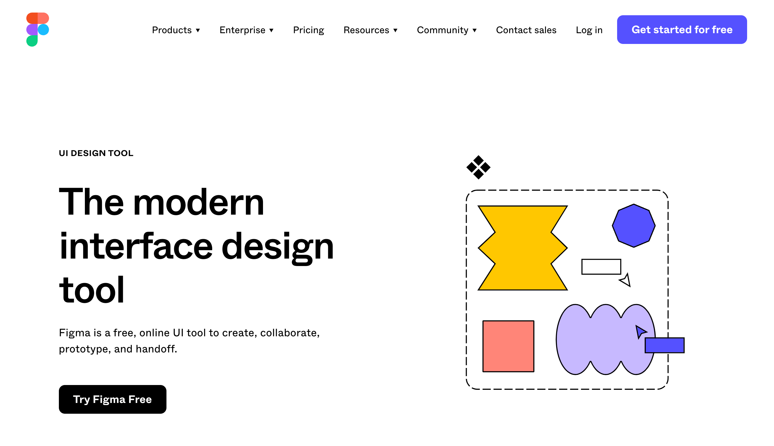
Figma is one of the most preferred UI design platforms among the user experience community, and for good reason.
Figma's UI Design Tool landing page is a compelling showcase of the platform's capabilities. With a clean, modern design that focuses on the product's features, the page immediately captures the visitor's attention. Succinct yet powerful text emphasizes the collaborative nature of Figma, its cloud-based benefits, and the ease of getting started. Figma demonstrates its what, why, and call to action in just a few words — an impressive display of value, and one that's often overlooked.
Providing learning resources and using testimonials from innovative and major brands that use the platform demonstrates the tool's effectiveness and solidifies credibility to curious onlookers, establishing the ethos needed to convert potential leads into new clientele.
Figma designed the page to engage, inform, and convert visitors, making it a standout. Perhaps this sharp design has helped them become the top UX/UI design platform. If it's not the design, then it's the carefully placed CTA buttons sprinkled throughout the landing page.
4. Apple’s Mac Pro landing page
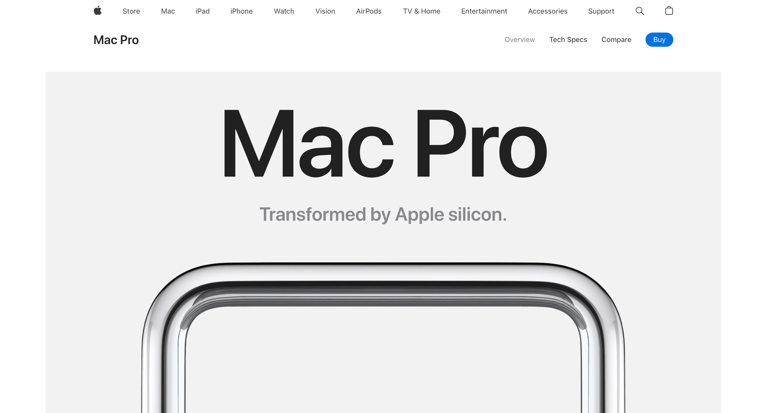
Apple's Mac Pro landing page is a paragon of minimalist design. The clean, white space accentuates the high-resolution product images, creating a striking visual impact. Subtle animations add dynamism, while intuitive navigation ensures a seamless browsing experience — the power of the scroll, or digital pager, is on full display, unveiling more pieces to the web page's narrative with each flick of the finger.
This approach in design reflects the premium nature of the Mac Pro. The sophisticated and professional user experience offers an informative guide through the product's features.
Apple begins its narrative in its traditionally minimalist fashion and sprinkles information about the specifications of its latest technology throughout the rest of the page. At the bottom of the page, Apple concludes with a plethora of CTAs to increase lead generation, nudging the visitor to explore the Mac Pro in augmented reality or compare Mac models, among other things.
5. ShareCalmly
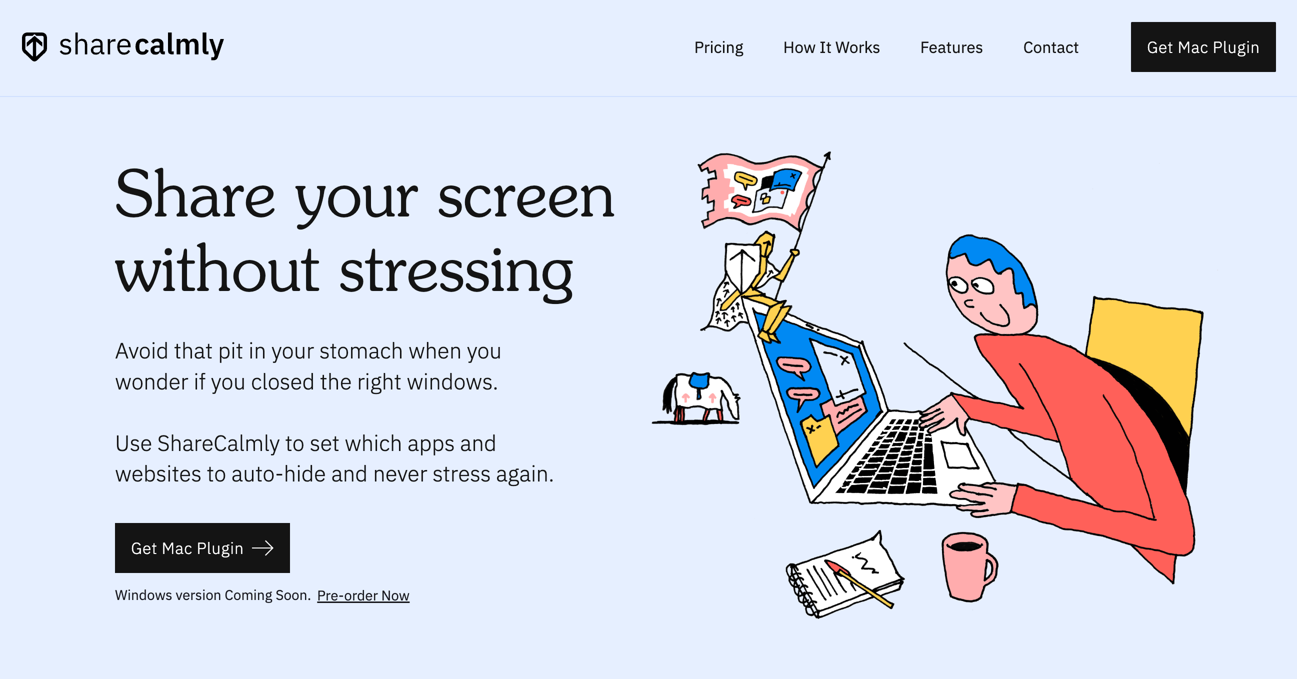
ShareCalmly is a great landing page example for startups and small businesses drawing a blank on their design, and it's made in Webflow. Like Figma and DoorDash, ShareCalmly's landing page is succinct and straightforward. The startup's ability to communicate its branding and key messaging takes center stage here.
ShareCalmly shines as a no-fuss solution to the stress of screen sharing. Their overall design and content effectively alleviate the stress associated with screen sharing.
The clean, straightforward design has a soothing color palette that aligns with the product's purpose. The text is clear and concise, using simple, relatable scenarios — like accidentally sharing personal texts or job search tabs — making the product's benefits tangible for the visitor.
Overall, ShareCalmly knows its target audience and communicates its value proposition in each fold, effectively demonstrating the product's value, functionality, features, and pricing throughout the rest of the page. They conclude with a tried-and-tested "get in touch" CTA at the bottom of the page.
6. ClickUp
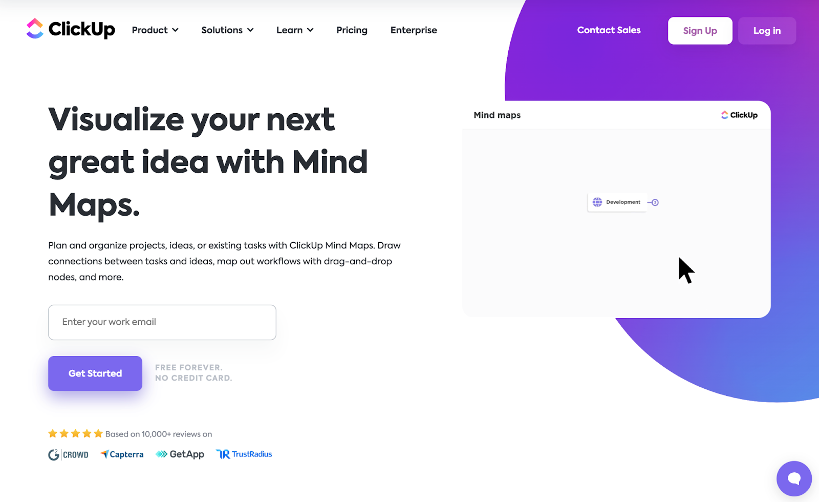
ClickUp's Mind Maps landing page is an inspiring landing page example for SaaS companies in the tech sector. It’s a real visual treat.
Showcasing the features and function of visual organization, the design is clean and intuitive, with a harmonious color scheme that enhances readability. The text is engaging and informative, outlining the key features of ClickUp Mind Maps, such as creating workflows with tasks, managing tasks directly from the Mind Map, and sharing Mind Maps with teams.
What makes ClickUp’s landing page design a true stand-out, however, is how it incorporates the brand identity throughout the page. It completely immerses you in the design, especially through its chunky product visuals and candy-like color scheme.
Including links to related articles provides visitors with additional resources, furthering the brand's ethos — its credibility. Overall, the design and content of this page beautifully demonstrate ClickUp's Mind Maps value and functionality.
7. Miro
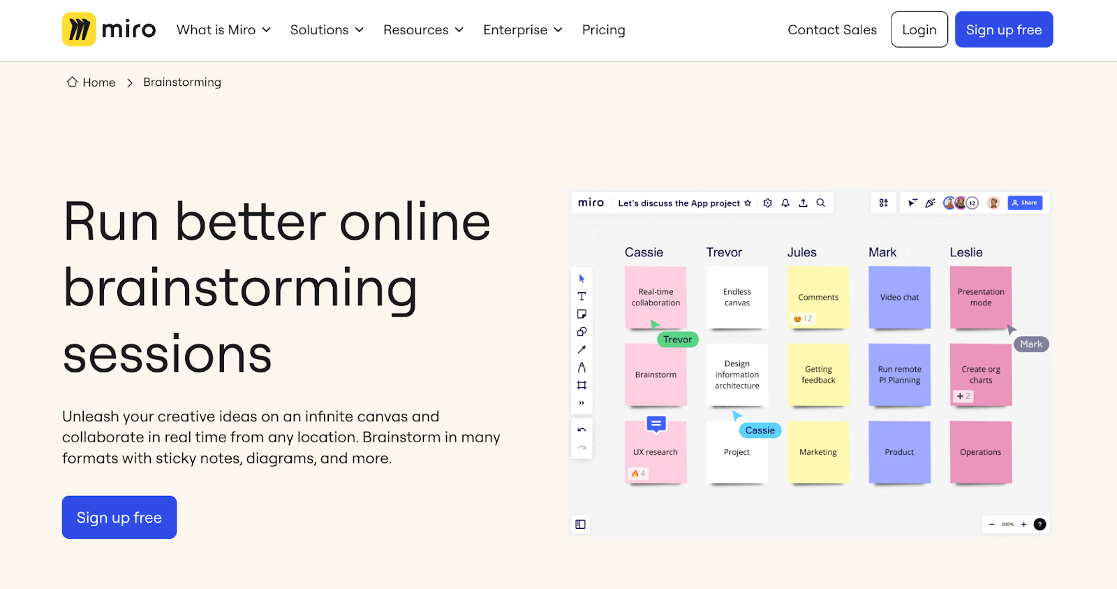
Another great landing page example for SaaS enterprises to draw inspiration from is Miro's Brainstorming landing page.
Like ClickUp, Miro's landing page design is a visual treat for page visitors. The round chunky typography and bright colors create a beautiful visual harmony, emphasizing the product on display.
A vibrant and interactive hub, Miro's design is colorful and engaging, with a mix of graphics, gifs, and text that holds the visitor's attention. The opening hero image and subsequent graphics visually communicate their product’s value to their target audience. They effectively outline the benefits of using Miro for brainstorming, such as collaborating in real-time, using online sticky notes, and structuring ideas with mind maps.
They provide additional resources for visitors, including related templates and guides, furthering the ethos of Miro. This page is not just a product showcase but a testament to the platform's claim of being the perfect brainstorming tool.
Overall, Miro's mesmeric motion graphics demonstrate the functionality of its product in each fold, with the landing page copy supporting each visual's claim. Miro perfectly executes this genius approach, making the concluding sign-up form all the more enticing to potential customers.
8. Memorisely
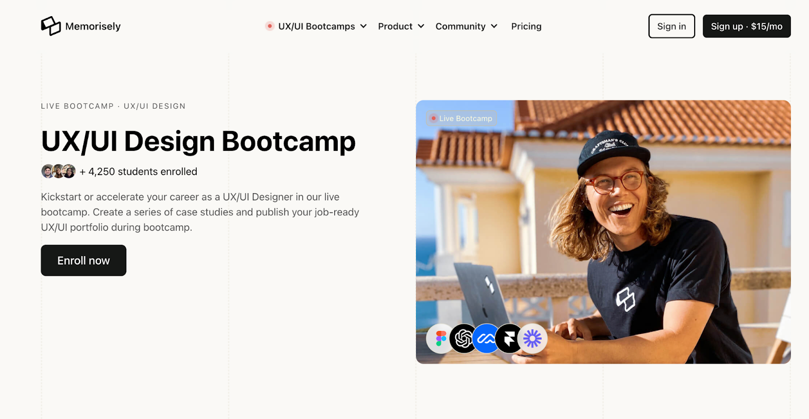
Memorisely’s landing page is by far one of the best landing page pages to emulate for education and learning platforms, and it’s made in Webflow.
Featuring a minimal, copy-focused design, Memorisely eliminates any noise, clearly delivering the what, why, how, and value. The clean and organized layout, using bold headings and subheadings, creates a structure that guides page visitors through the course details, making the information easy to digest.
The page effectively communicates the benefits of the boot camp, such as live classes, case study creation, and career support. The inclusion of testimonials from alumni adds credibility and provides a personal touch. The design and content of this page tell you exactly what you will gain by enrolling in the Memorisely Bootcamp.
A static sidebar menu outlines the course’s curriculum with an Enroll Now CTA button that tracks down the page as the visitor scrolls throughout the web page functions. This genius addition to the overall comprehensive guide highlights Memorisely’s immersive online learning experience.
9. Webflow Designer

Webflow's Designer landing page is another example SaaS companies can draw inspiration from.
Similar to Apple's web design, the power of the scroll is in full effect — unveiling the Designer's vast capabilities via a parallax effect. Not only does this design trick fully immerse page visitors, it's also an ideal method to intuitively organize long-form content. This clean layout creates a logical flow that guides visitors through the tool's features, telling a story in the process. The vibrant colors and dynamic graphics add visual interest while concise text highlights each of the Designer's features. These features include building with raw HTML elements, creating reusable components, and designing with real content.
The list of established enterprises using Webflow in the concluding fold adds that final layer of credibility for page visitors. The adjacent “it's free” beside the “Get started” CTA button eliminates any hesitations for new customers — and, of course, this landing page was made in Webflow.
10. Shef
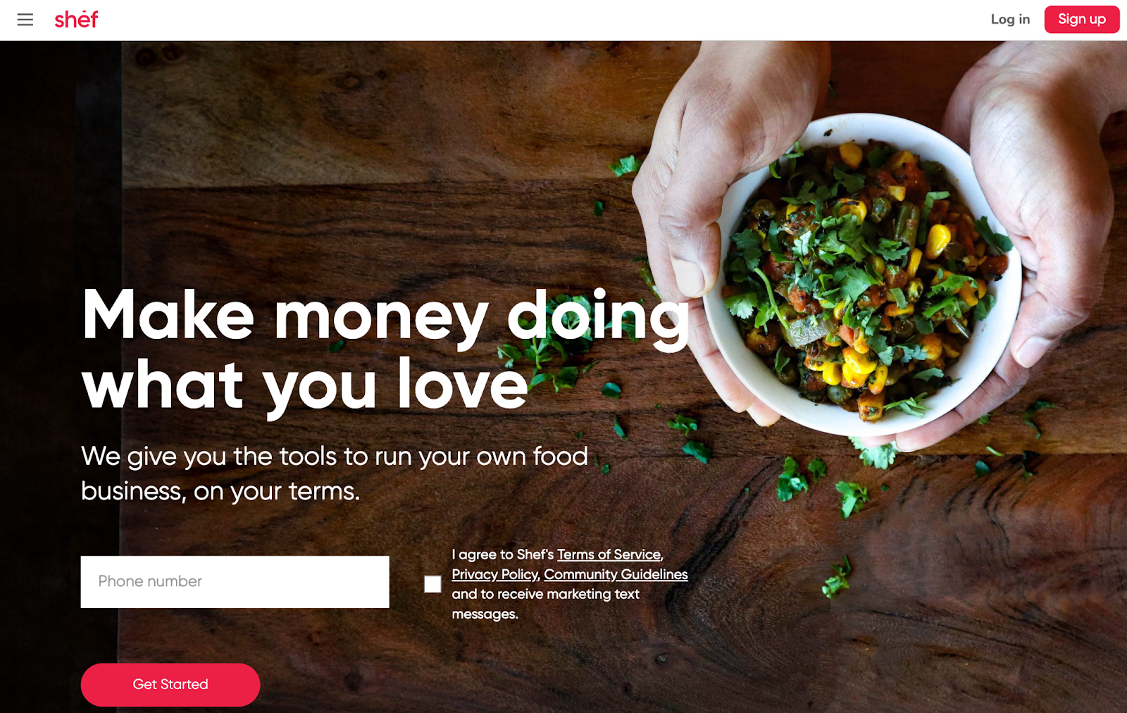
Shef’s landing page is a particularly great example for small business owners seeking to create a platform to expand their reach and generate leads.
Using a similar design approach to DoorDash, Shef opens with a hero image and call to action opt-in that reveals the platform’s what, why, and how in just a few words — establishing itself as an inviting and informative platform ideal for aspiring cooks.
The design is clean and friendly, with a warm color palette alluding to the welcoming atmosphere that is Shef. The clear and concise landing page copy outlines the process and benefits of becoming a Shef, such as setting your own schedule, crafting your menu, and serving happy customers.
Incorporating testimonials from current Shefs, video highlights, and FAQs reaffirms the value Shef provides for aspiring chefs and foodies alike. These features add a personal and authentic touch to the landing page design while communicating the opportunities and support that come with becoming a Shef.
11. Stripe for marketplaces
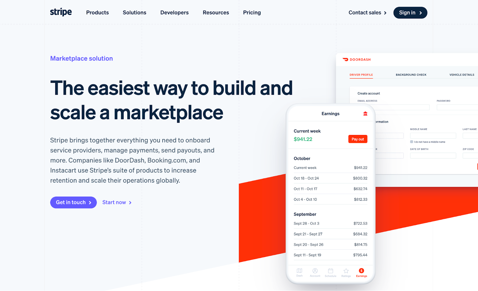
Stripe's Marketplaces landing page is dynamic and comprehensive, mindfully designed to present the functionalities and complexities of the well-known marketplace companion platform.
The sleek and modern design has a clear structure that guides visitors through the benefits of using Stripe for marketplaces. Stripe delivers their copy, though complex,in a concise, digestible way to their target audience. We see this approach immediately in the introductory fold as it directly communicates what Stripe does and, most importantly, their value.
Upon scrolling, visitors see a detailed and interactive presentation of Stripe's capabilities, who their target market is, and why this marketplace needs the visitors' services — particularly e-commerce industries. Engaging graphics and concise text highlight key features such as global payments, fraud prevention, and seamless payouts.
We’re greeted with case studies that add a layer of credibility and provide real-world examples of the platform's capabilities, demonstrating the marketplace companion's value and versatility.
12. Nightwatch Rank Tracker
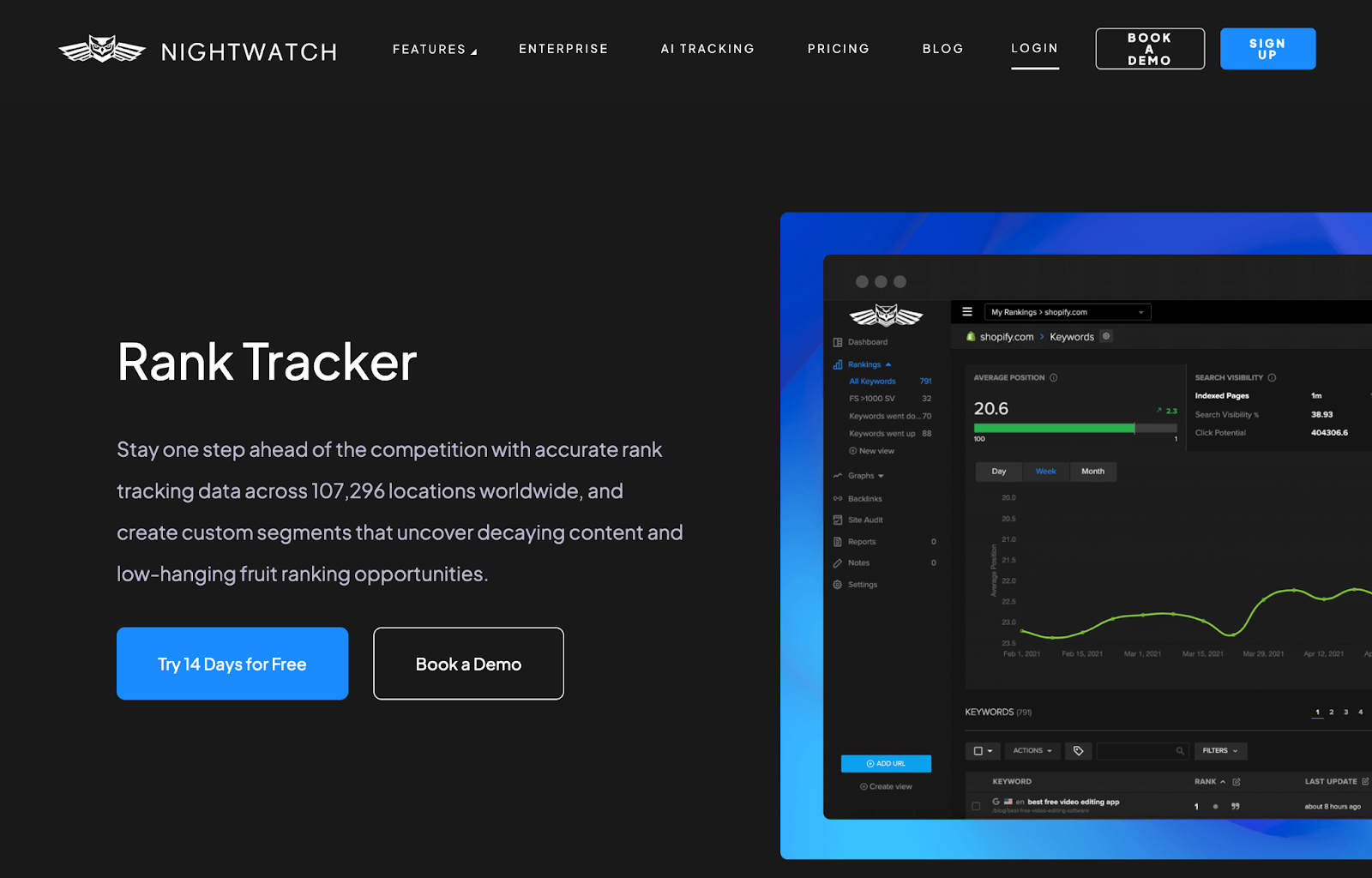
Designed in Webflow, the landing page for Nightwatch Rank Tracker is straightforward and streamlined, targeting businesses seeking to optimize their search engine rankings.
The design is clean and professional, following a “claim, support, graphic (and repeat)” structure, as the landing page guides the curious visitor through the SEO tool's powerful features.
Engaging graphics and concise text highlight key features such as tracking rankings across multiple search engines, automated reports, site auditing, and keyword discovery. The page's call-to-action invites visitors to start a free trial.
13. Dropbox Sign
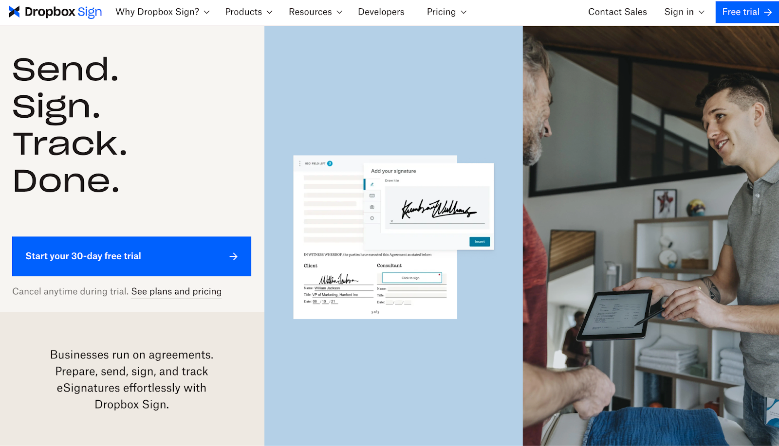
Dropbox Sign also employs the tried and true “claim, support, graphic” approach to its landing page design. The warm and creamy off-white undertones set the aesthetic while complementing the page's logical flow and form.
The clean and user-centric design enhances DropBox Sign’s ease of use and value beautifully — demonstrating the platform’s trust with subtle aesthetic touches.
As the visitor scrolls, they find concise text highlighting the platform's key features, informative drop-downs, additional features, and a final CTA prompting the visitor to try the platform for free.
Sometimes, less is more.
14. Gusto
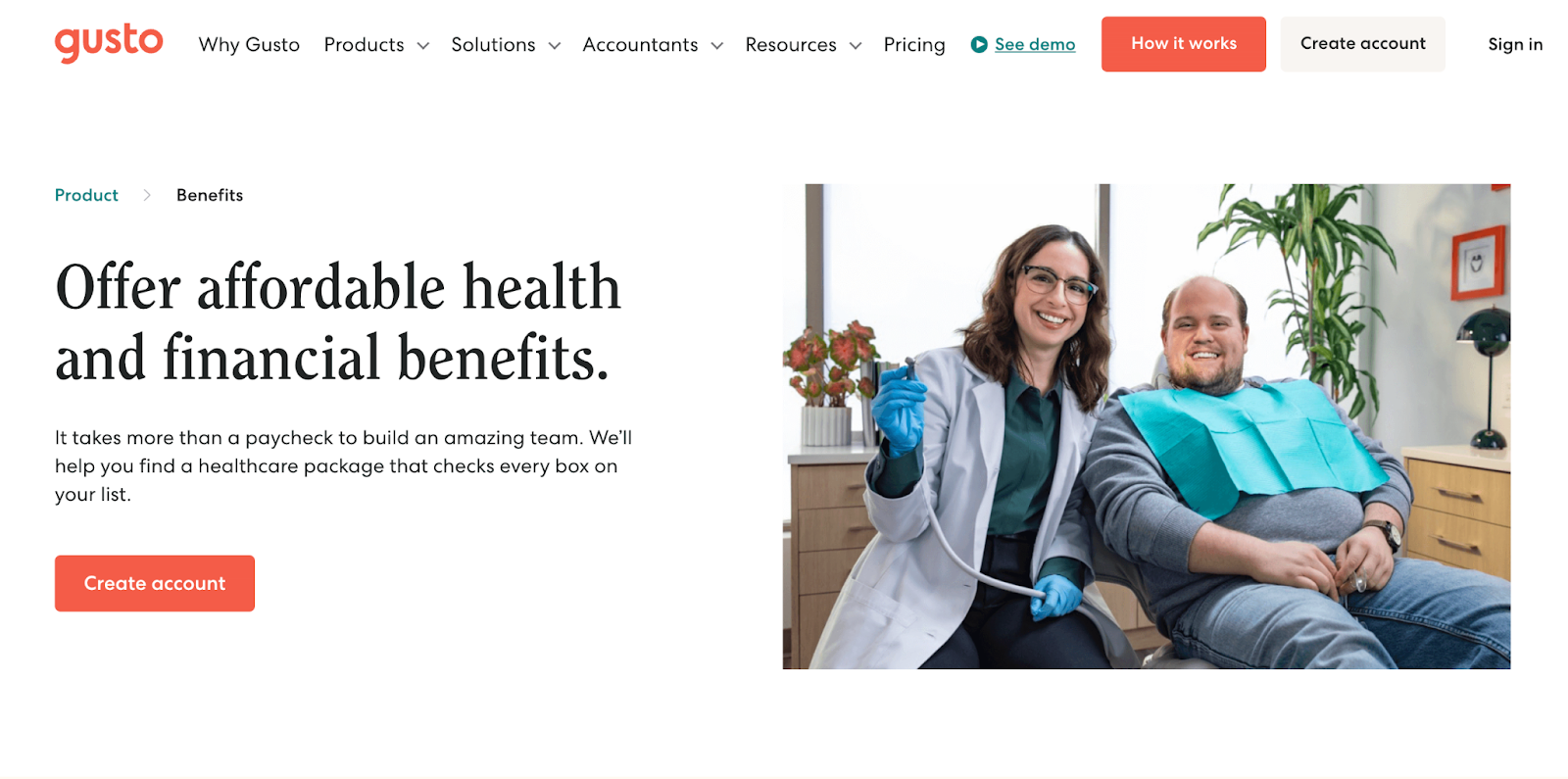
Gusto's Benefits landing page is an exciting, refreshing take on SaaS design, using colorful graphics and design elements to make complex information engaging.
The playful yet informative approach to design sets Gusto in a league of its own. The playful approach in design takes a mundane subject like employee benefits and humanizes it, invoking a feeling of fun and play. This sense of excitement and empowerment not only humanizes the platform's offerings but also makes said offerings all the more appealing. The bite-sized text blocks also make the intricacies of employee benefits digestible — ideal for communicating the platform's value without overwhelming the page visitor with complexities.
This clarity is why Gusto’s landing page stands out. They know their target audience and, more importantly, how to appeal to them. By acknowledging and validating their audience's needs, they impart an idea of empowerment and complete control, reaffirming to potential customers that this platform is the solution they've been seeking.
15. Wise
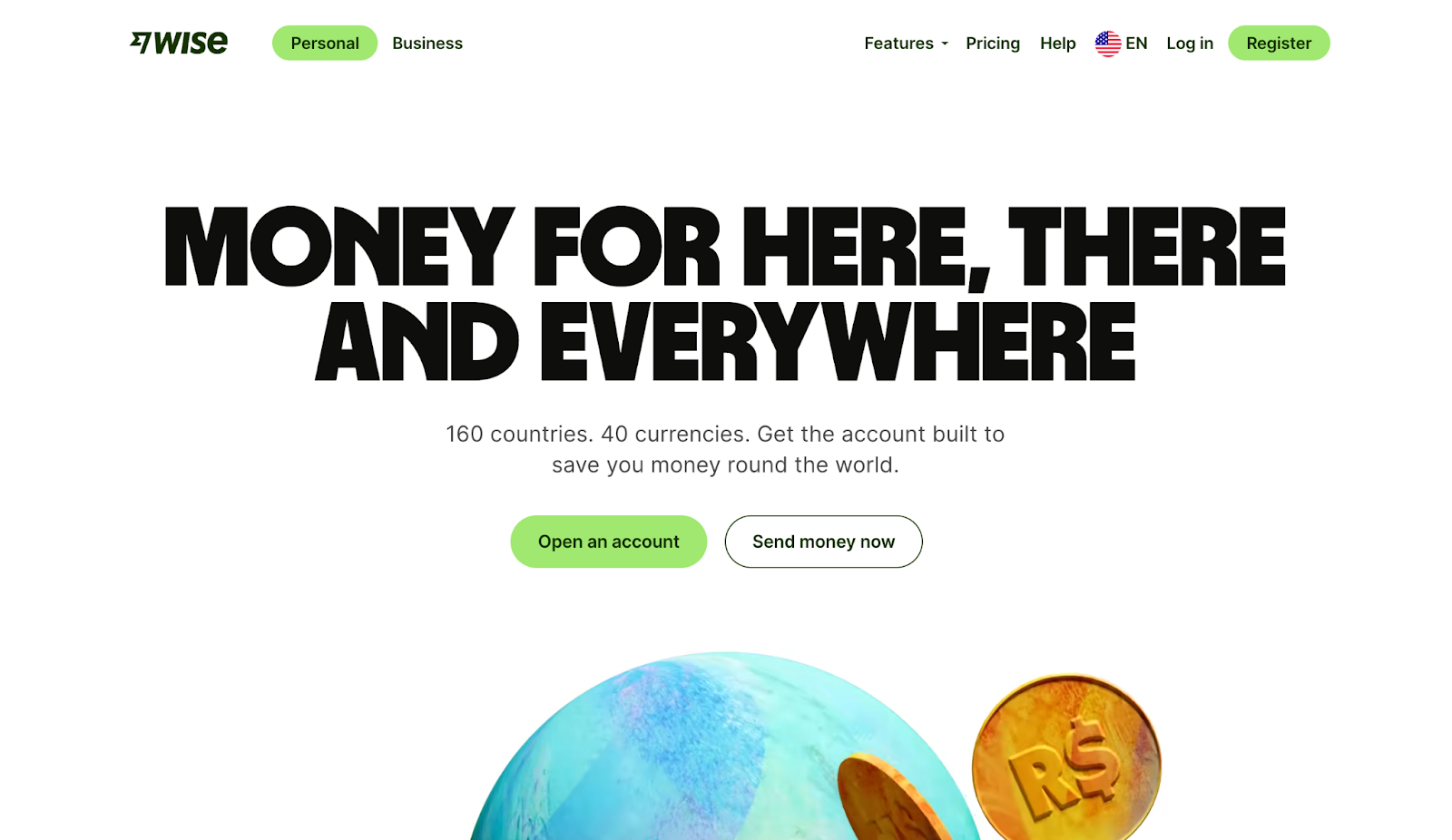
On the subject of humanizing design, we have Wise's vibrant and energetic US landing page.
Wise sets the tone with a bold, almost mesmeric motion graphic that perfectly encapsulates the platform's “what.” Coupled with concise and oh-so-sweet copy that communicates the “why,” page visitors can't help but scroll to unveil more, and so, they scroll.
Upon scrolling, the web page greets visitors with a wonderfully bright, clean, and colorful design. Their clear structure guides visitors through the benefits and features of using Wise. Amongst the features and benefits lie calls to action specific to each fold's offerings, a wise marketing inclusion on Wise's end.
Engaging graphics and concise text highlight key features such as low-cost money transfers, multi-currency accounts, and an interest feature on USD balances. The page also includes a section on security measures, providing reassurance for potential users. This wise decision concludes the page on a note that fosters trust after a page-long display of the platform's value.
16. Keeper
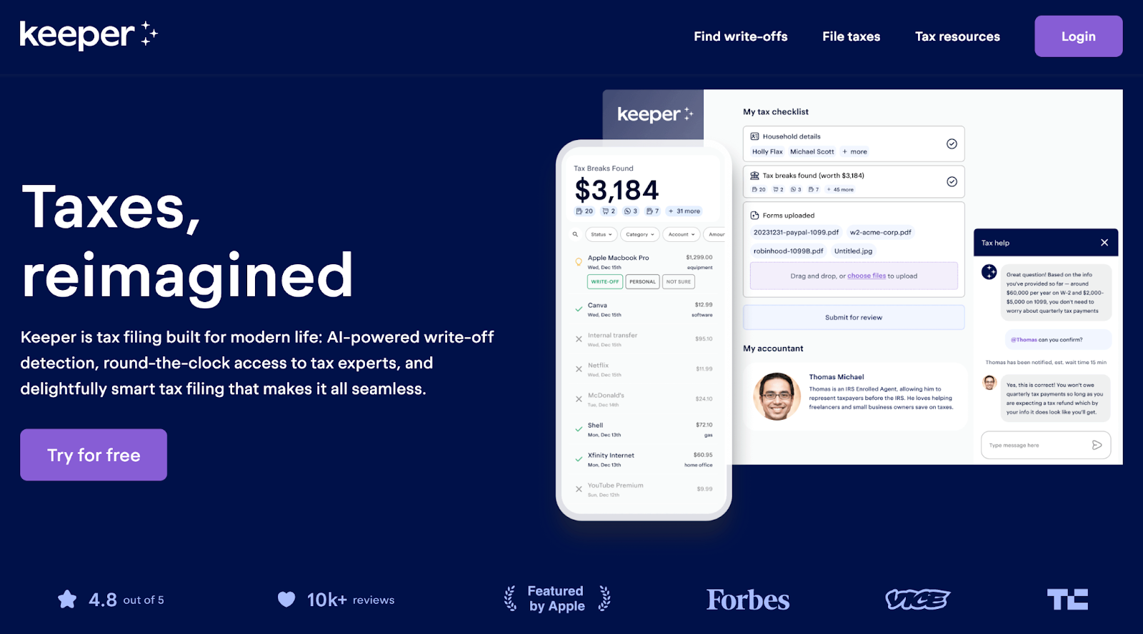
Storytelling truly has no bounds. No matter the medium, product, service, or brand, all you need is the right team and a bit of magic. With an opening line of copy that reads “Taxes, reimagined” and a beautifully designed landing page, Keeper clearly has the perfect combination of the two.
Streamlined and user-friendly, this landing page embodies the promises of Keeper and tells a story within itself. The top of the page greets the visitor with a delightful and affirming value statement and CTA, alongside a hero image illustrating exactly how magical tax filing is with Keeper. This approach immediately kicks off the landing page's narrative, one in which page visitors envision the efficient, magical ease Keeper promises.
The use of engaging graphics and concise text highlights key features such as personalized tax filing, automatic uncovering of tax breaks, and professional review of tax returns — further detailing the what, why, and how of the platform.
This clear structure guides visitors through the benefits and features of using Keeper, before concluding with a comparison graphic, pricing, and testimonials. All of these elements foster the platform's credibility and clarity for the curious onlooker.
17. Slack
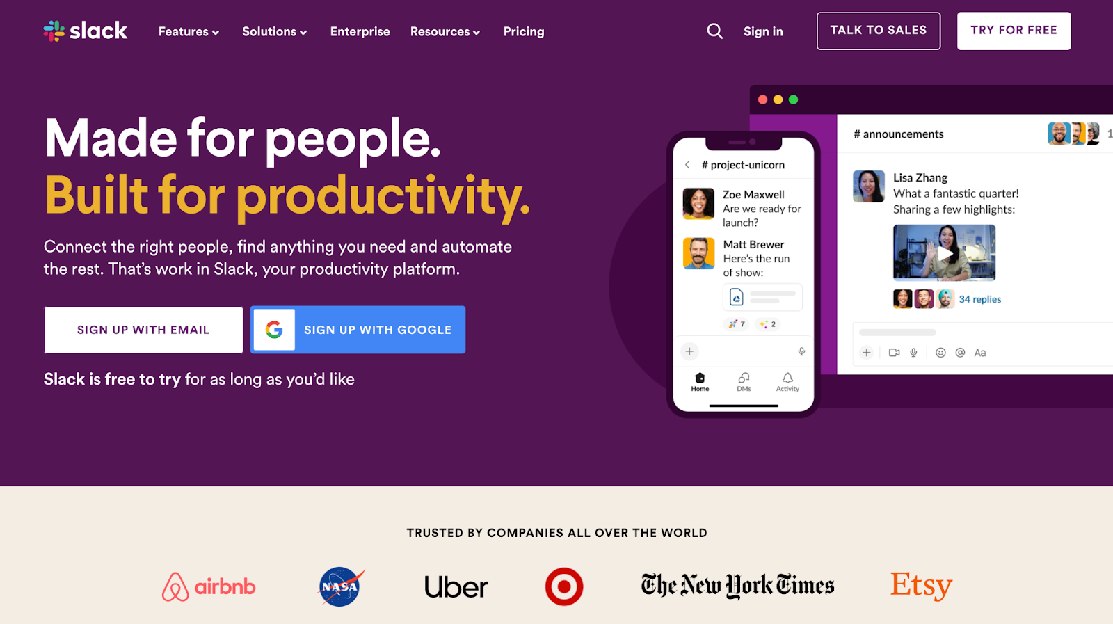
Slack has risen as the go-to platform for workplace communication and collaboration and is now the leading platform for industries both new and old. While the page is brief, Slack's homepage is a compelling showcase for this productivity tool. Through captivating graphics and text to underscore key features, Slack creates a homepage that is crisp and contemporary.
The well-organized layout intuitively leads visitors through Slack's features, presenting its features and credentials, with user testimonials strategically placed to add authenticity and engender trust. Introductory and concluding calls to action prompt the visitor to try for free.
Collectively, these elements make the Slack homepage an informative and engaging experience that effectively conveys the value of Slack's platform.
18. Drive with Uber

Streamlined to focus on onboarding potential drivers, the Drive with Uber landing page is optimized for clarity and conversion.
Presenting only the most relevant information, Uber eliminates any potential confusion or doubt in its target audience. This focused and efficient design is an excellent inspiration for any business looking to onboard new subscribers with absolute ease. The central feature is an onboarding form field, making the process of becoming a driver straightforward and incredibly easy — ideal for both the potential driver and Uber.
It’s important to note, however, that Uber’s Drive page works largely because the platform is nearly universally known. That said, if you have a product or service that’s universally understood or simple in nature and you’re looking to design a landing page geared towards onboarding new subscribers, look to Uber’s Drive for inspiration.
19. Mailchimp
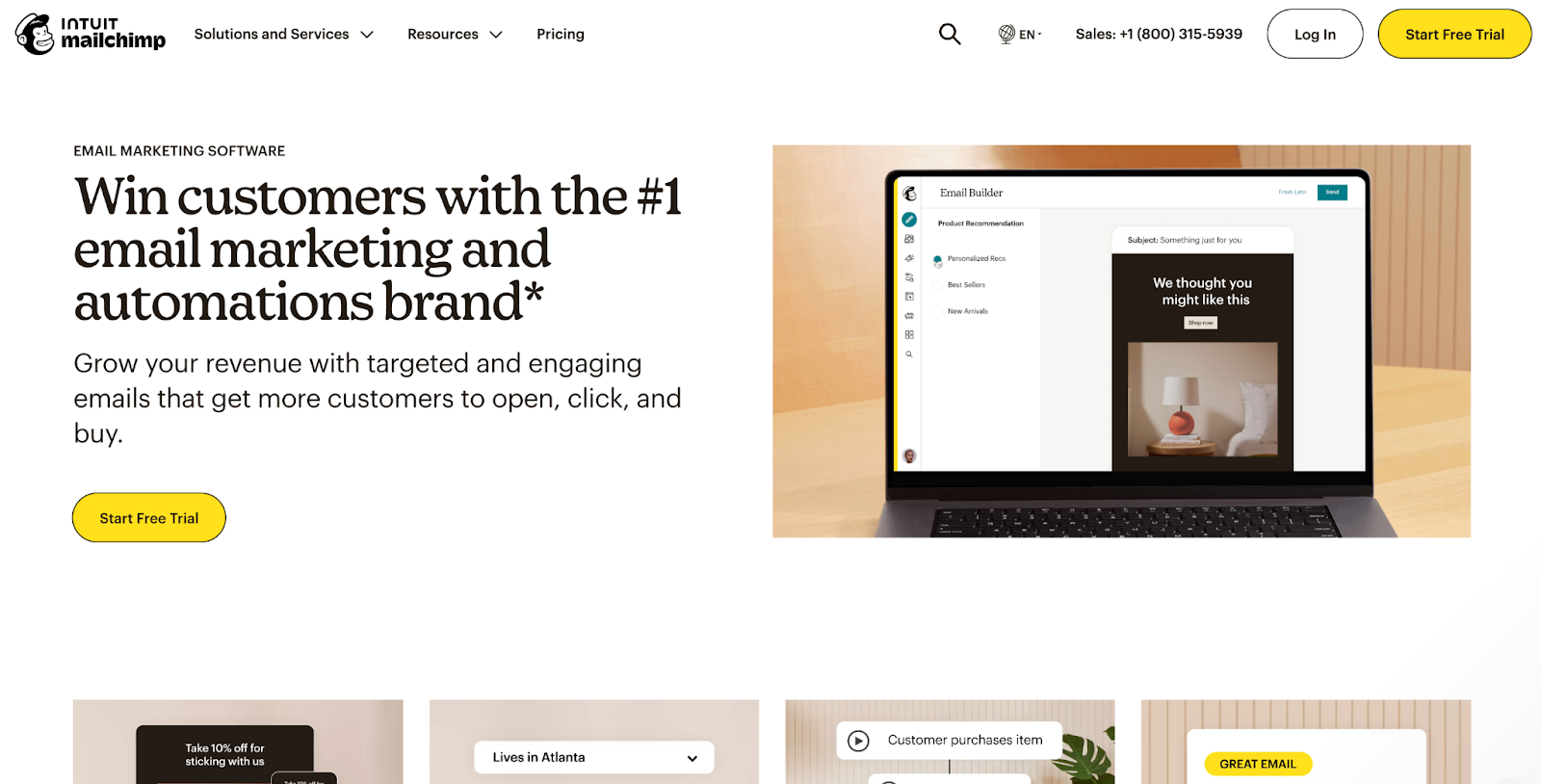
Mailchimp is an entrepreneur's must-have for email marketing. Having helped many small businesses and startups grow and succeed, Mailchimp is well aware of its position as the top email marketing tool in the online marketplace — made wonderfully evident in its Email Marketing landing page.
Made for businesses looking to enhance their email marketing strategies, MailChimp makes its value proposition evident to the curious onlooker.
The design is crisp and modern. Engaging graphics and detailed text explore key features, such as predictive segmentation, A/B testing, and enhanced automated customer journeys, all while alluding to the platform's value. Further, the detailed section depicting its transparent pricing provides clarity for potential customers.
This extensive landing page reads more as a how-to guide than the traditional pitch you'd find with most landing pages, leaving no stone unturned for page visitors.
20. Airbnb
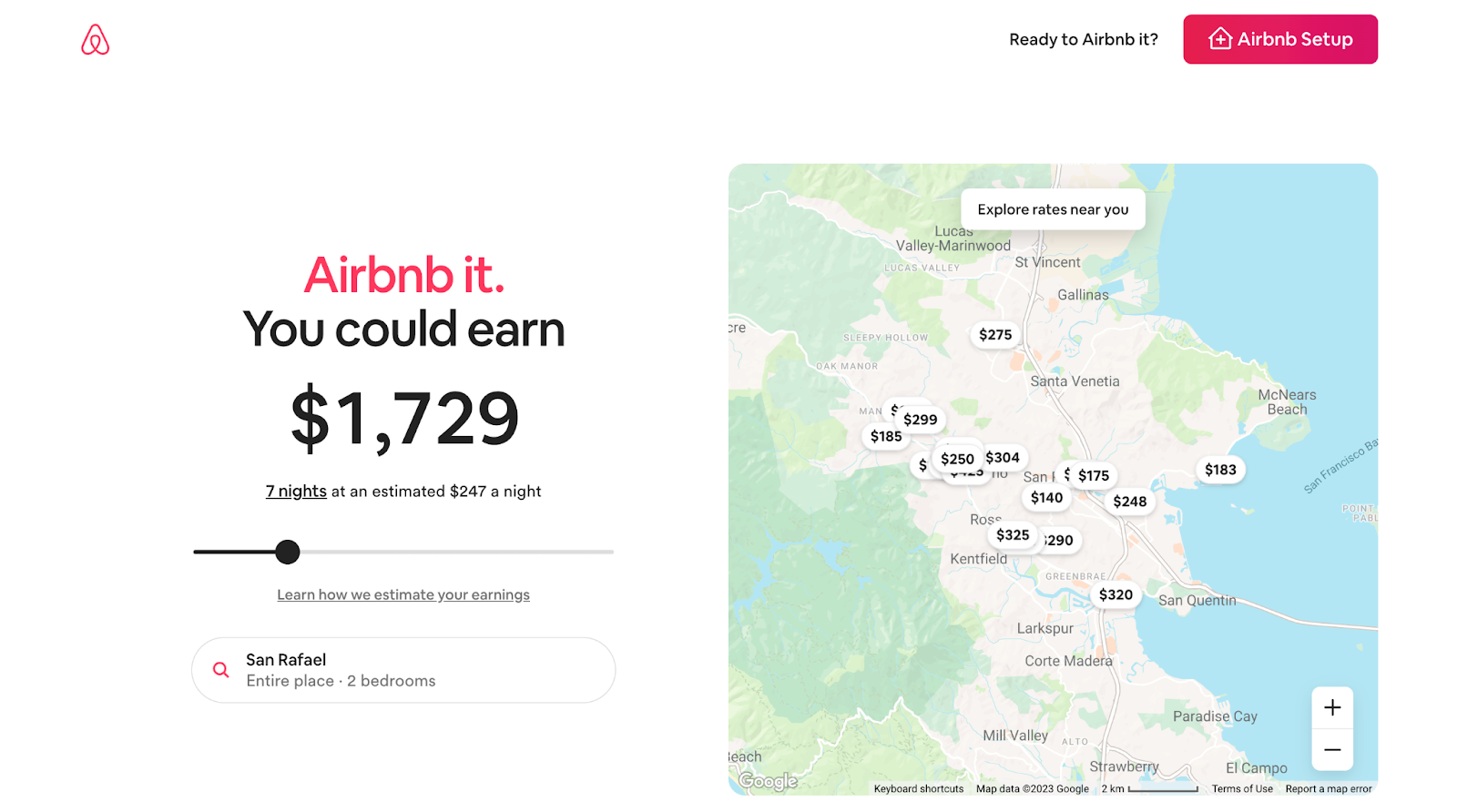
Airbnb's Host Homes landing page is informative and inviting to the curious property owner flirting with the idea of hosting on the well-known platform.
Its stripped-down, pragmatic approach to design presents all the relevant information a curious onlooker may be seeking, including a “You could earn” estimation based on your current location at the top of the page. This approach idyllically presents Airbnb’s benefits to its target audience.
The rest of their design is clean and straightforward, guiding page visitors through the process, features, and benefits of hosting with Airbnb. These benefits include one-to-one guidance from a Superhost, specialized support, and top-to-bottom protection.
The page ends with an FAQ section and a final CTA button prompting the visitor to connect with a Superhost if they have any remaining questions.
21. Proof Pulse
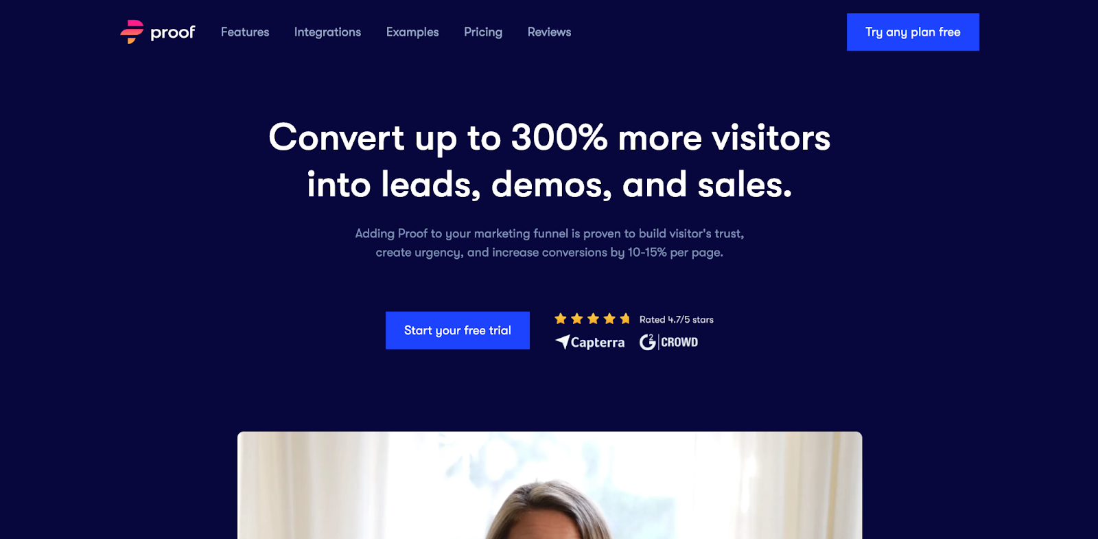
Proof Pulse’s landing page is comprehensive, to say the least — and it's made in Webflow.
Proof designed their webpage to be dynamic and informative, breaking down the complexities of their product while appealing to the needs and desires of their target audience.
The page opens with a video to serve as the page's hero image, giving visitors a digestible way of consuming the platform's core message. This strategy is smart; it allows Proof to explain how their product works and further appeal to visitors in a medium beyond a web page.
What follows the opening fold is a clean and professional design, with a layout that's highly structured to guide the page visitors through its many features and benefits. Modern and colorful visuals illustrate the platform's interface while showcasing Proof Pulse's expansive features. Their inclusion of case studies is a nice touch, particularly in the way they designed this section — opting for a slider instead of the traditional bullet points.
The page concludes with an exhaustive line-up of testimonials before signing off the page with its final CTA — an email list opt-in.
This page effectively communicates the value of Proof Pulse's services, making it an appealing destination for businesses looking to enhance their website conversions.
22. Kajabi
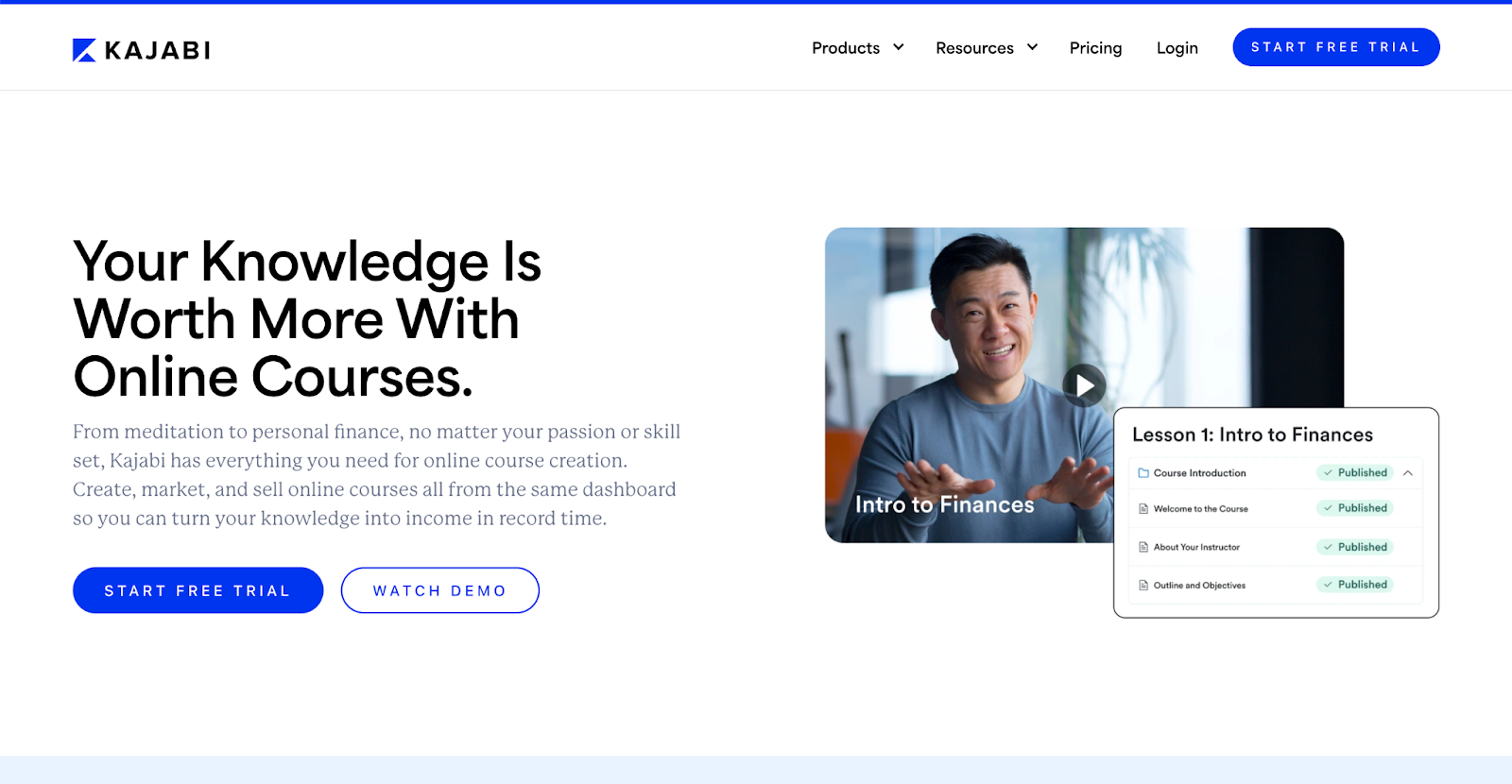
At first glance, Kajabi's Online Courses landing page seems like your typical landing page. It's well-designed and comprehensive while remaining user-friendly. However, if you take a deeper look, you’ll see the quiet gem on display — the page's copy.
Kajabi specifically tailors their core value to their target audience, which is primarily made up of entrepreneurs and influencers. Concise without compromising its value proposition or messaging, Kajabi’s copy guides the curious visitor through the product, process, and benefits of creating digital products. It minimizes potential confusion by focusing its message on the essentials.
Their use of images showing regular people in addition to graphics depicting the product’s key features — such as creating online courses, podcasts, membership sites, and coaching programs — further paints the “what,” “how,” and “why” behind Kajabi to the page visitor.
This stellar landing page was also made in Webflow.
23. Gemnote
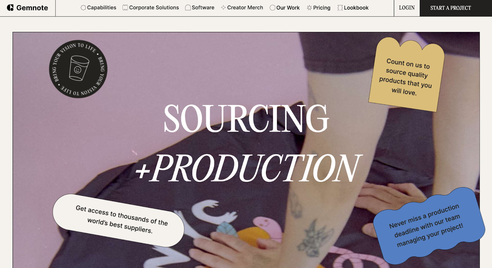
Another web page made in Webflow is Gemnote's interactive and lively sourcing & production landing page. This page stands out as visually engaging and is a creative take on the traditional “how it works” page.
Its sleek and professional design effortlessly guides curious onlookers through the customization journey, sprinkling fun animated design effects throughout the page for the added twist on branding. Subtle effects unveil with each flick of the finger, enticing page visitors to keep scrolling.
The rest of the page uses aesthetic imagery, cleverly placed dancing graphics and typography, captivating visuals, and short and sweet descriptions to bring the brand to life. Its various unique customization techniques like embroidery, screen printing, and embossing are on full display. An additional section dedicated to quality paper goods further enriches the service offerings and encapsulates the breadth and depth of Gemnote's customization services.
The unmatched quality and care of Gemnote's products are made evident throughout the entirety of this landing page, elevating the unique brand from its competitors.
24. Loom for Marketing
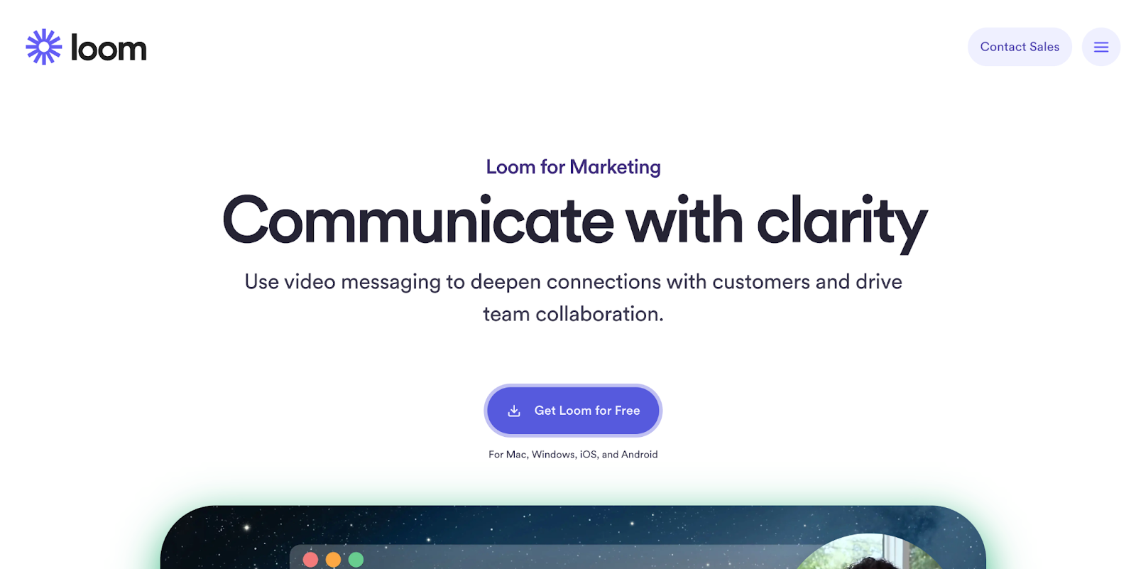
Incorporated as a marketing tool for brands such as HubSpot, Lacoste, Atlassian, FabFitFun, and Intercom, Loom has quickly risen as a favorite within the industry, in part due to its variety of use cases. You can quickly understand how Loom managed to secure such conversion rates for lead generation by taking a look at its Loom for Marketing landing page.
Not only is the page engaging and informative, it's incredibly concise in its delivery. The structure of the page's narrative is clear yet persuasive, packaged in a clean, refreshing layout, and rid of any fluff in its messaging.
This clear structure guides visitors through the benefits of using Loom for marketing. Almost like a tutorial, each fold builds upon the next in its messaging. The graphics are inviting and visually highlight the platform's key features, such as customizable CTAs, engagement insights, drawing tools, and rich reactions.
Overall, Loom's landing page design wonderfully communicates the value of the platform services for marketing teams, making it an appealing destination for those looking to enhance their marketing strategies with video content.
25. Buffer
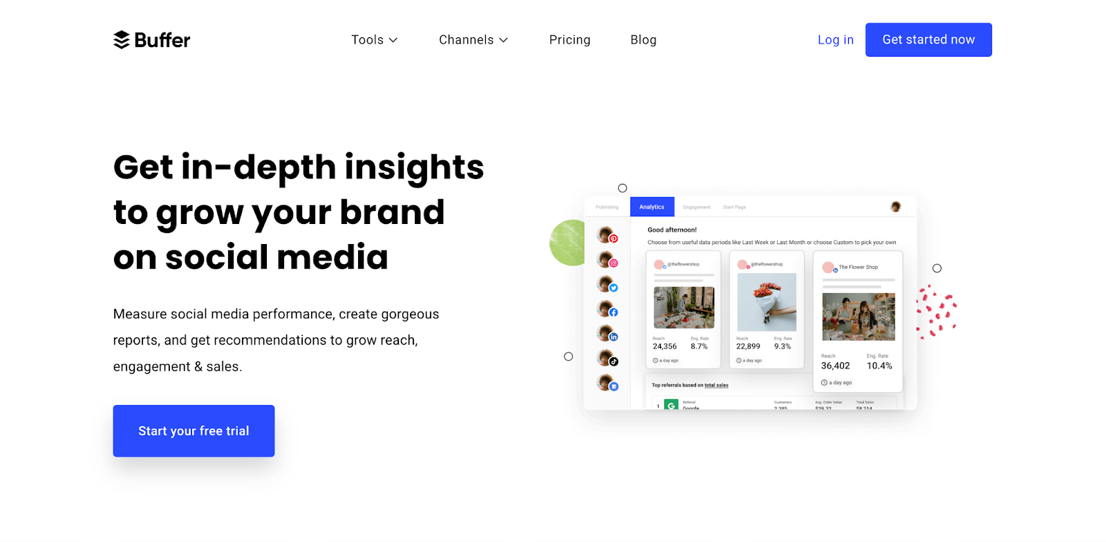
Buffer's Analytics landing page is quite the delight to come across. The platform's use of colorful illustrations is both inviting and encouraging, reimagining the topic of social media and content marketing analytics into something of fun and wonder.
Buffer's design is clean and professional, with a clear structure that guides visitors through the benefits of Buffer Analyze. The additional fun graphics and vectors around each product screenshot emphasize each key feature. A FAQ section provides additional information for potential customers while furthering the platform's credibility, before the page concludes with a simple yet appealing CTA.
26. Intercom
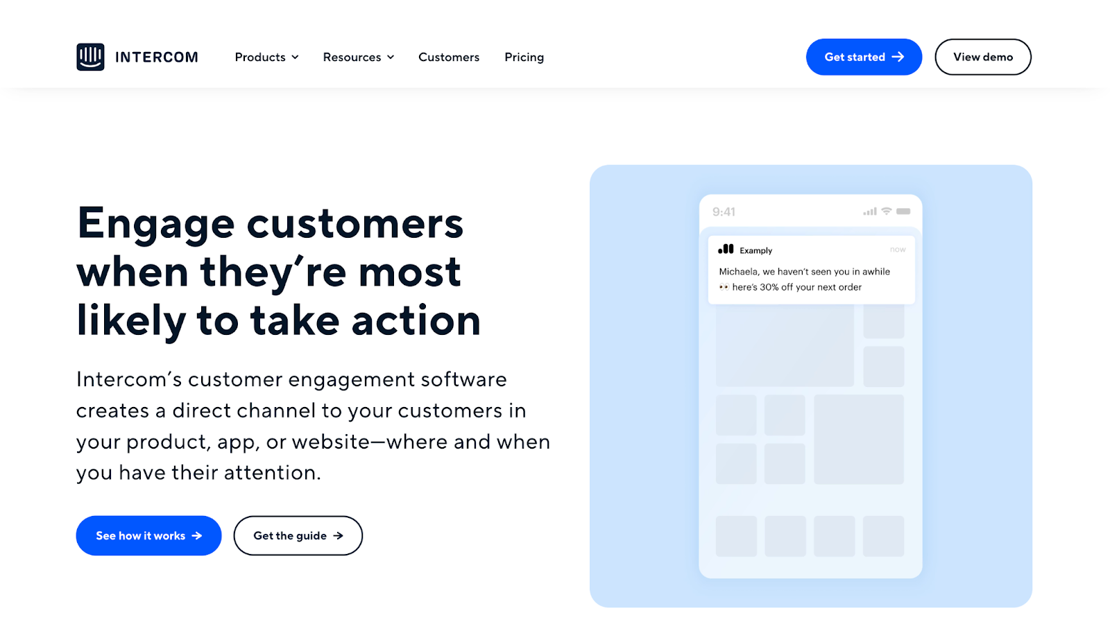
Another great landing page example that effectively communicates the value of a complex product is Intercom's Engage landing page.
Intercom presents us with a page that's dynamic and informative; clean in design yet packed with value, this page guides visitors through the benefits of using Intercom for customer engagement.
By employing pleasantly engaging motion graphics, hard-hitting statistics, and ever-so-concise copy, Intercom conveys a clear and firm sense of ease, agility, and control. This approach likely increases conversion rates and generates new leads, as people are more likely to invest in a new product or service when they can fully understand what the product is and the value it provides.
27. Lattice
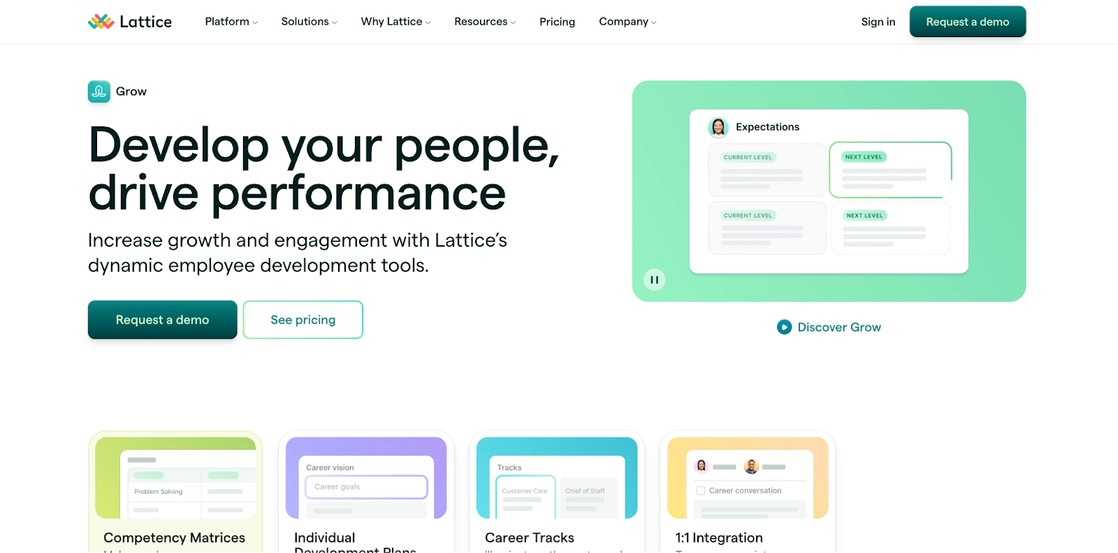
Lattice's Grow page is a wholly impressive landing page that incorporates both interactive design and the power of the scroll. Another example made in Webflow, Lattice doesn't skip a beat.
This web page is comprehensive yet sleek and professional, transforming what would have been long-form content into interactive text blocks that aesthetically highlight its benefits and key features.
With a logical flow guiding page visitors throughout the platform's offerings, captivating visuals and testimonials enclose its concise yet informative copy, taking Lattice's powerful features to new heights.
28. AngelList
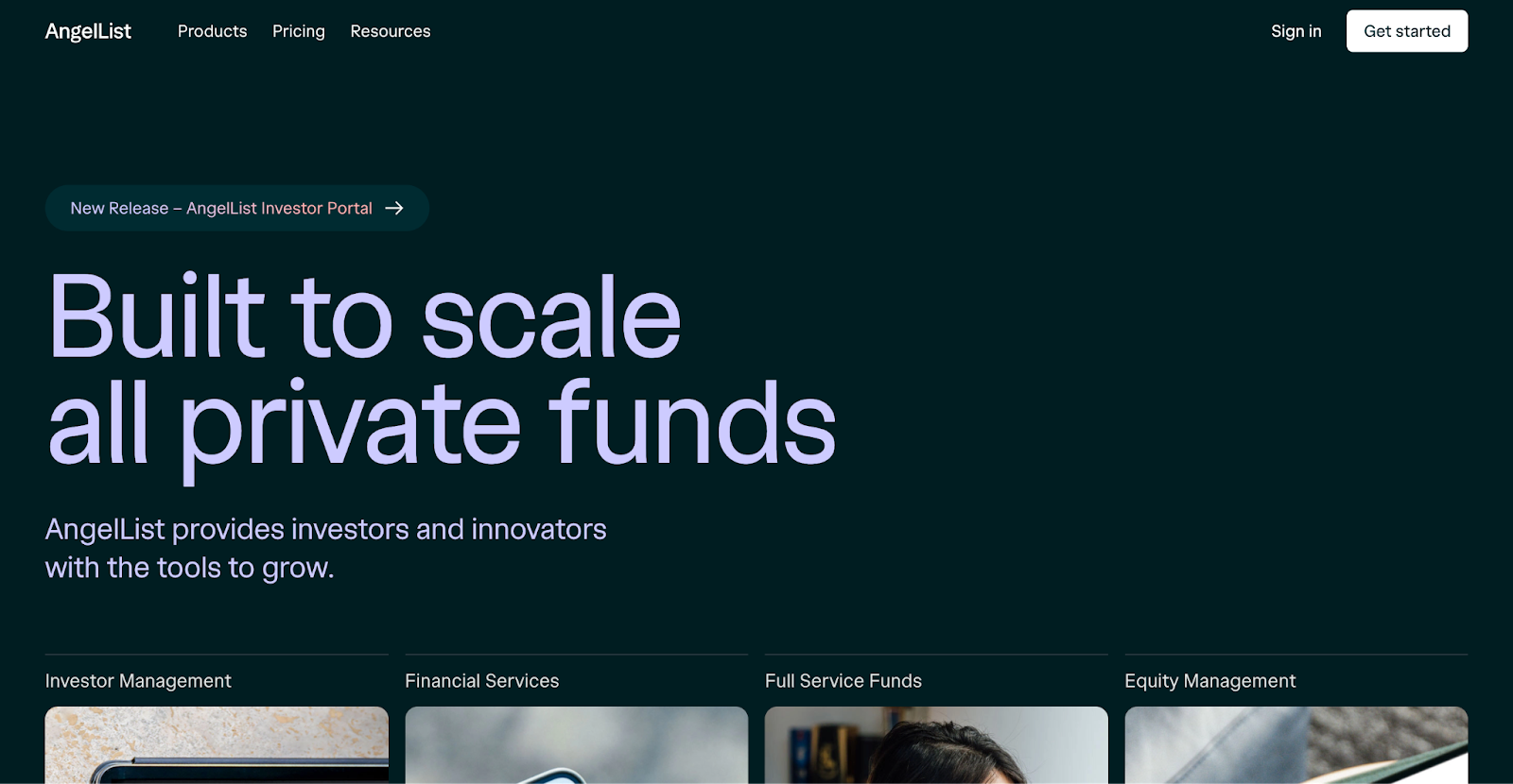
AngelList's homepage is a compelling showcase of the platform's innovative capabilities, reimagining the very foundation of traditional landing page design — and they did so using Webflow.
The design is modern and minimalist, with a static value statement that follows the curious newcomers throughout the platform's core offerings — a genius design choice.
Through this “show, don't tell” approach to design, the AngelList highlights the platform's mission to build, lead, and invest in startups. Not only does this approach humanize AngelList Venture’s efforts and further the platform's ethos, it bolsters the site's claims of accelerating innovation, making the concluding CTA to ”Build with AngelList” all the more enticing.
29. Talkspace for Business
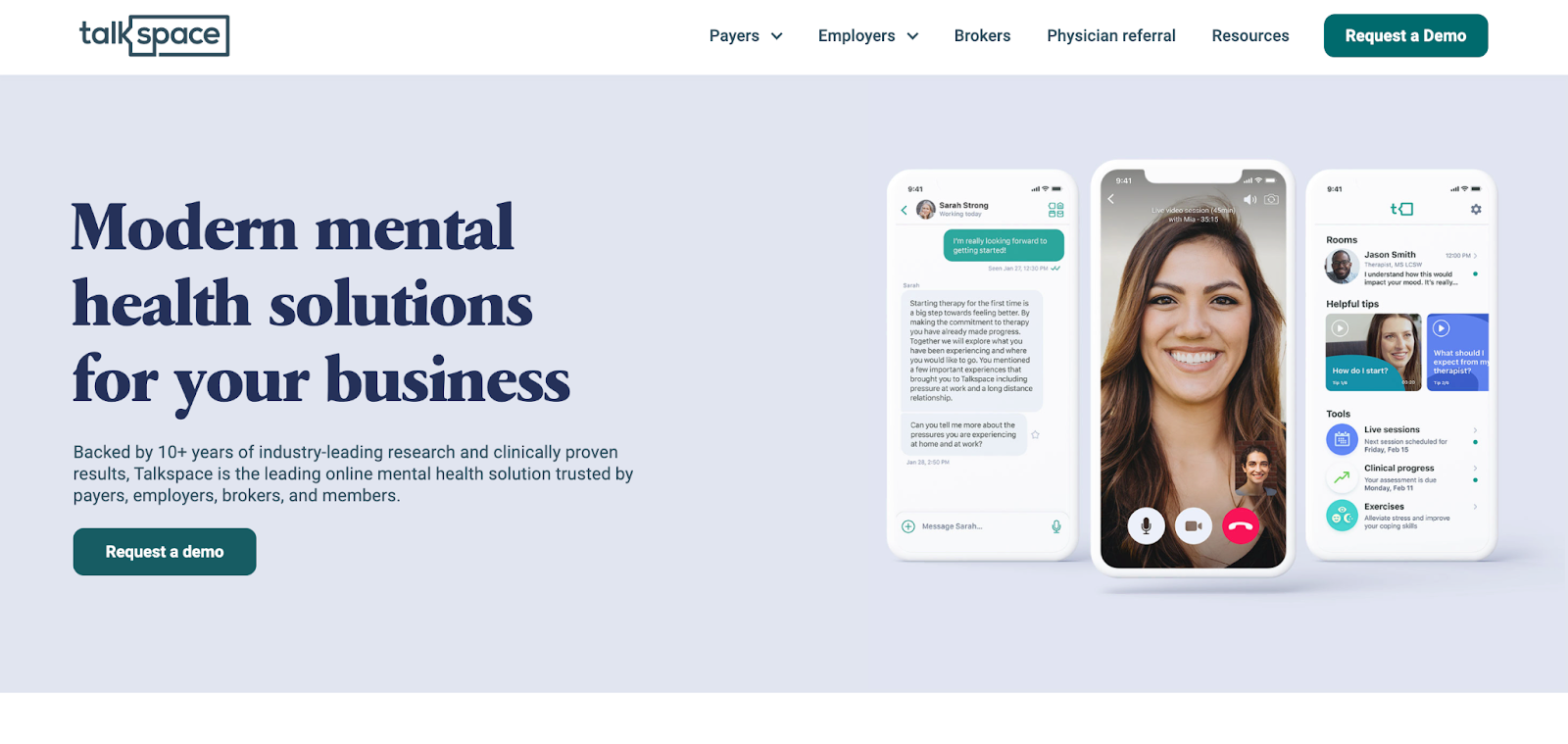
The landing page for Talkspace for Business puts the ”modern” in modern mental health solutions.
Through its clean and professional design, moving vectors, and informative statistics, Talkspace effectively communicates its value to its target audience, positioning itself above its competition.
The structure of this web page is clear yet incredibly detailed, speaking to the benefits and features of the modern health solution platform. The page supports each of its claims with statistics that further demonstrate Talkspace's value statement. This extra layer of credibility eliminates any residing doubt in the curious page visitor's mind.
Overall, this landing page design wonderfully communicates the value of Talkspace's services — oh, and yeah, they did so in Webflow.
30. VanMoof
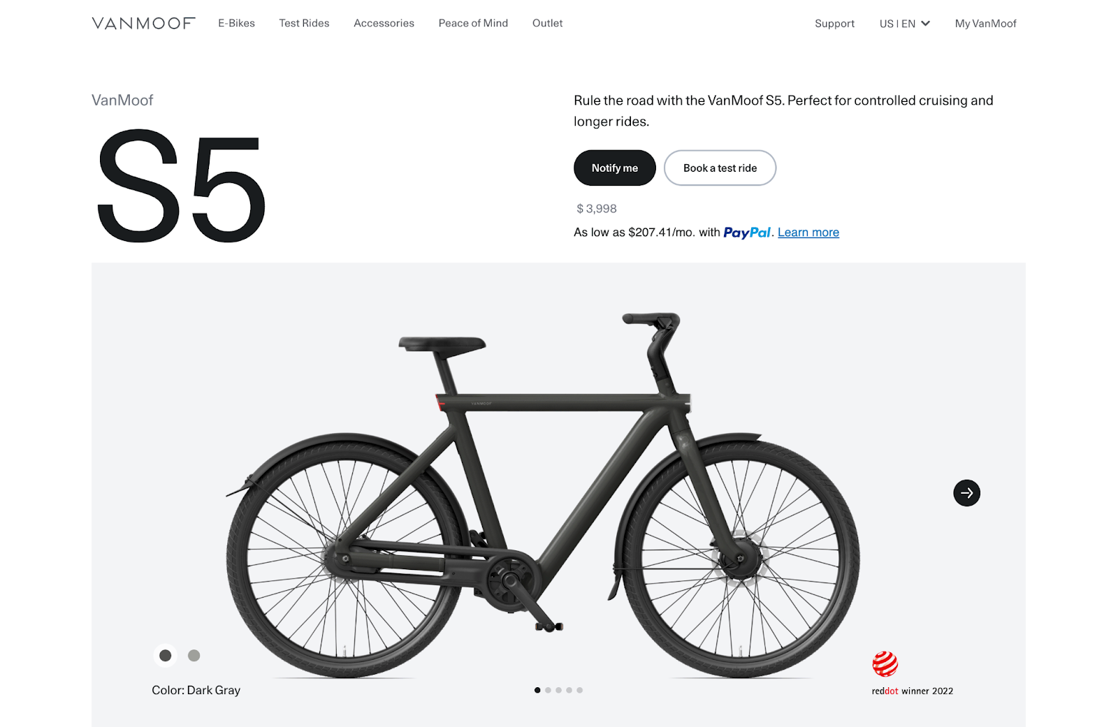
Where Apple set a new standard for tech landing page design, the team behind VanMoof's design took it and ran crafting its product landing pages.
The S5 landing page is captivating and elaborate, with immersive motion graphics highlighting the latest tech in the biking industry. This sleek and contemporary approach to design is enticing and exciting as the engrossing product images fascinate and invoke a sense of desire in its target audience, regardless of the hefty price tag.
After coming across this landing page, you won’t want just any bike; you want the next-gen VanMoof S5, and that's all thanks to immaculate web design.
31. Misfits Market
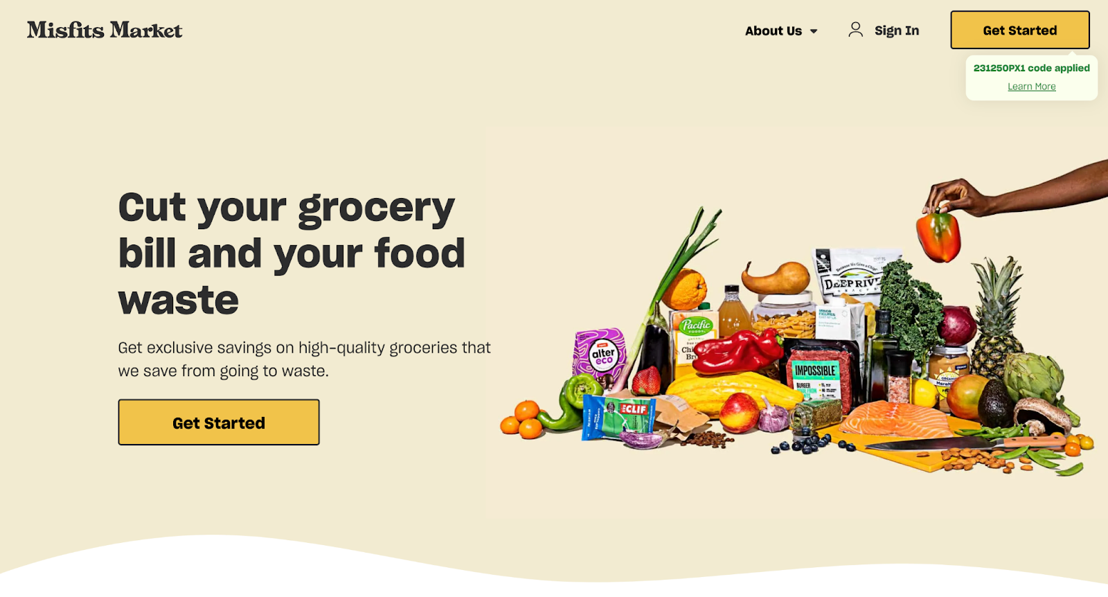
The Misfits Market landing page is a beauty. Vibrant and engaging, the platform truly puts its stamp on fighting food waste through its informative copy and delightful branding.
This colorful yet clean design speaks to the platform's core audience. It employs a clear narrative structure that guides curious page visitors through the process of ordering organic produce and sustainably sourced pantry staples.
The graphics and real-life imagery further communicate the platform's mission and benefits, concluding with a clear CTA email list opt-in that excites and invites visitors to sign up and start saving.
Great landing pages are a click away
So there you have it — our list of some of the best landing page inspiration you’ll find online. We hope you enjoyed these web designs and found these examples insightful and inspiring.
Great landing page design requires a deep understanding of your users problems and needs. If you’re feeling inspired, check out Webflow University and put these insights into practice.
Build completely custom, production-ready websites — or ultra-high-fidelity prototypes — without writing a line of code. Only with Webflow.
Build completely custom, production-ready websites — or ultra-high-fidelity prototypes — without writing a line of code. Only with Webflow.