Seeing Like an Algorithm
In my previous post on TikTok I discussed why its For You Page algorithm is the connective tissue that makes TikTok work. It is the bus on its motherboard that connects and closes all its feedback loops.
But in the breathless rush to understand why companies might want to acquire TikTok, should ByteDance be forced to divest itself of the popular short video app, the hype around its algorithm has taken on a bit of exoticization that often characterizes Western analysis of the Chinese tech scene these days.I kept holding off on publishing this piece because every day seemed to bring some new development in the possible ban of TikTok in the U.S. And instead of writing any introduction that would become instantly outdated, I'll just leave this sidenote here to say that as of publishing this entry, it seems Oracle will take over the TikTok cloud computing deal while also joining Wal-Mart and some VCs in assuming some ownership stake in TikTok Global. But it won't surprise me one bit if we find out even more bizarre details over the next week. This is the type of deal that I would have thought could only happen in Succession, but even in that satire it would seem hyperbolic. The 2020 Writer's Room is undefeated.
In this post, I want to discuss exactly how the design of TikTok helps its algorithm work as well as it does. Last time I discussed why the FYP algorithm is at the heart of TikTok’s flywheel, but if the algorithm wasn’t effective then the whole feedback loop would collapse. Understanding how the algorithm achieves its accuracy matters even if you’re not interested in TikTok or the short video space because more and more, companies in all industries will be running up against a competitor whose advantage centers around a machine learning algorithm.
What I want to discuss is how TikTok’s design helps its algorithm “see.”
Seeing Like a State by James C. Scott is one of those books that turns you into one of those Silicon Valley types that use (abuse?) the term legibility. I first heard about it after reading Venkatesh Rao’s summary of its main themes, and that piece remains a good tldr primer on the book if you don’t plan to read the text (Scott Alexander's review of the book is also good though is long enough that it could almost justify its own tldr). However, I recommend that you do.
The subtitle of Scott’s book is “How Certain Schemes to Improve the Human Condition Have Failed.” In particular, Scott dissects a failure state that recurs across a number of domains, in which a governing body like the nation-state turns to what Scott terms high modernism in an effort to increase legibility of whatever it is they are trying to exert control over, whether for the purposes of taxation or conscription or any number of goals. In doing so, they impose a false sense of order on a reality more complex than they can imagine.It would really be fascinating to hear from Scott on the case of modern China, under CCP rule, with modern technology for surveillance, and whether he thinks they will prove or violate his thesis in the fullness of time.
It’s a book that raises one’s awareness of all sorts of examples of unintended consequences in day-to-day life. We all could use a healthier does of humility when we are too flush with great man hubris. The world is richer and more complicated than we give it credit for.
As an example, much of what Scott discusses has relevance to some of the hubris of our modern social networking giants. These dominant apps are designed to increase legibility of their user bases for, among other things, driving engagement, preventing churn, and ultimately, serving targeted advertisements. That, in turn, has led their parent companies into a thicket of problems which they’re grappling with constantly now.
But that is a topic for another post, another day. Whereas Scott focuses in on how the nation-state uses simplifying abstractions to “see” its citizens at a synoptic level, I want to discuss how TikTok’s application design allows its algorithm to “see” all the detail it needs to perform its matchmaking job efficiently and accurately. If Seeing Like a State is about a common failure state, this post is about a new model for getting the most leverage from machine learning algorithms in the design of applications and services.I’m aware of the irony that the controversy around TikTok was the potential of user data being accessed by the CCP, or being “seen by that state.” Or that one of the sticking points of this new Cold War is the Chinese Firewall, which selects what the citizens of China “see.” And which most U.S. tech companies sit outside of, looking in.
In recent years, one of the realizations in machine learning, at least to an outsider to the subject like myself, is just how much progress was possible just by increasing the volume of training data by several orders of magnitude. That is, even if the algorithms themselves aren’t that different than they were a few years ago, just by training them on a much larger datasets, AI researchers have achieved breakthroughs like GPT-3 (which temporarily gave tech Twitter a tantric orgasm).
When people say that TikTok’s algorithms are key to its success, many picture some magical block of code as being the secret sauce of the company. The contemporary postmodernist Russian writer Viktor Pelevin has said that the protagonist of all modern cinema is a briefcase full of money. From the briefcase of radioactive material (I think that’s what it was?) in Kiss Me Deadly to the briefcase of similarly glowing who knows what (Marcellus Wallace’s soul?) in Pulp Fiction, from the Genesis equation in The Formula to the secret financial process in David Mamet’s The Spanish Prisoner, we’ve long been obsessed in cinema with the magical McGuffin. In recent weeks, discussion of TikTok’s algorithm has elevated it into something similar, akin to one of those mystical archaeological artifacts in one of the Indiana Jones films, like the Ark of the Covenant, the Holy Grail, or the lingam Shivling.
But most experts in the field doubt that TikTok has made some hitherto unknown advance in machine learning recommendations algorithms. In fact, most of them would say that TikTok is likely building off of the same standard approaches to the problem that others are.
But recall that the effectiveness of a machine learning algorithm isn’t a function of the algorithm alone but of the algorithm after trained on some dataset. GPT-3 may not be novel, but trained on an enormous volume of data, and with a massive number of parameters, its output is often astonishing.
Likewise, the TikTok FYP algorithm, trained on its dataset, is remarkably accurate and efficient at matching videos with those who will find them entertaining (and, just as importantly, at suppressing the distribution of videos to those who won’t find them entertaining).
For some domains, like text, good training data is readily available in large volumes. For example, to train an AI model like GPT-3, you can turn to the vast corpus of text already available on the internet, in books, and so on. If you want to train a visual AI, you can turn to the vast supply of photos online and in various databases. The training is still expensive, but at least copious training data is readily at hand.
But for TikTok (or Douyin, its Chinese clone), who needed an algorithm that would excel at recommending short videos to viewers, no such massive publicly available training dataset existed. Where could you find short videos of memes, kids dancing and lip synching, pets looking adorable, influencers pushing brands, soldiers running through obstacle courses, kids impersonating brands, and on and on? Even if you had such videos, where could you find comparable data on how the general population felt about such videos? Outside of Musical.ly’s dataset, which consisted mostly of teen girls in the U.S. lip synching to each other, such data didn’t exist.
In a unique sort of chicken and egg problem, the very types of video that TikTok’s algorithm needed to train on weren’t easy to create without the app’s camera tools and filters, licensed music clips, etc.
This, then, is the magic of the design of TikTok: it is a closed loop of feedback which inspires and enables the creation and viewing of videos on which its algorithm can be trained.
For its algorithm to become as effective as it has, TikTok became its own source of training data.
To understand how TikTok’s created such a potent flywheel of learning, we need to delve into its design.
The dominant school of thought when it comes to UI design in tech, at least that I’ve grown up with the past two decades, has centered around removing friction for users in accomplishing whatever it is they’re trying to do while delighting them in the process. The goal has been design that is elegant, in every sense of the word: intuitive, ingenious, even stylish.
Perhaps no company has more embodied this school of design than Apple. At its best, Apple makes hardware and software that is pleasingly elegant—“it just works”—but also sexy in a way that makes its users feel tasteful. Apple’s infamous controlling style—no replaceable batteries for its phones and laptops, the current debate over its App Store rules—put the company squarely in the camp of what Scott in Seeing Like a State refers to as high modernism. Is there any reason to show a video of how the new MacBook Pro body is crafted from one solid block of aluminum (besides the fact that Jony Ive cooing “a-loo-MIN-eee-um” is ASMR to Apple fans) when unveiling it at an Apple keynote? How about because it’s sexy AF to see industrial lasers carving that unibody out of a solid chunk of aluminum? And later, when you’re cranking out an email at a coffee shop on said laptop, some residual memory of that video in your unconscious will give you just the slightest hit of dopamine?
There’s a reason this user-centric design model has been so dominant for so long, especially in consumer tech. First, it works. Apple’s market cap was, at last check, over 2 trillion dollars. Remember when fake Sean Parker said a billion dollars was cool? That was just a decade ago and a billion dollars is no longer S-Tier. The wealth meta moves fast. Furthermore, we live in the era of massive network effects, where tech giants who apply Ben Thompson’s aggregation theory and acquire a massive base of users can exert unbelievable leverage on the markets they participate in. One of the best ways to do that is to design products and services that do what users want better than your competitors.
This school of design has been so dominant for so long that I’ve almost managed to forget some of the brutal software design that used to the norm in a bygone era.Not to be confused with brutalist design, which can be quite beautiful in its own respect, like its architectural cousins.
But what if the key to serving your users best depends in large part upon training a machine learning algorithm? What if that ML algorithm needs a massive training dataset? In an age when machine learning is in its ascendancy, this is increasingly a critical design objective.
More and more, when considering how to design an app, you have to consider how best to help an algorithm “see.” To serve your users best, first serve the algorithm.
TikTok fascinates me because it is an example of a modern app whose design, whether by accident or, uhh, design, is optimized to feed its algorithm as much useful signal as possible. It is an exemplar of what I call algorithm-friendly design.I thought about calling it algorithm-centric design but felt it went too far. Ultimately, a design that helps an algorithm see is still doing so in service of providing the user with the best possible experience. This might still be considered just a variant of user-centric design, but for those teams working on products with a heavy machine learning algorithm component, it may be useful to acknowledge explicitly. After all, when a product manager, designer, and engineer meet to design an app, the algorithm isn't in attendance. Yet its training needs must be represented.
James Scott speaks of “seeing like a state,” of massive shifts in fields like urban design that made quantities like plots of land and their respective owners “legible” to tax collectors. TikTok’s design makes its videos, users, and user preferences legible to its For You Page algorithm. The app design fulfills one of its primary responsibilities: “seeing like an algorithm.”
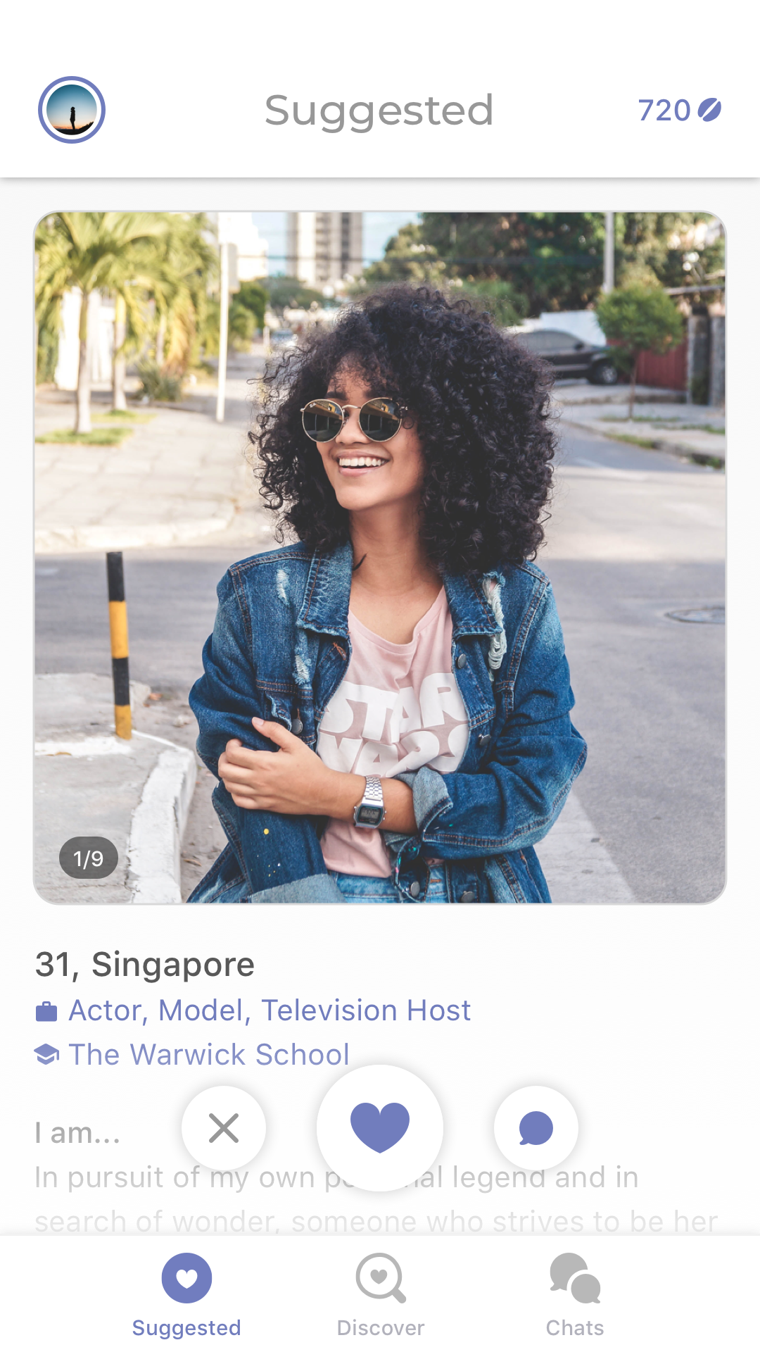
Let’s take a closer look. TikTok opens into the For You Page and goes right into a video. This is what it looks like.
This is, as of right now, the most popular TikTok ever. By the time I publish this post, its 34.1M likes will likely be outdated. You can read the story of how this TikTok even came to be and it will still feel like a cultural conundrum wrapped in a riddle stuffed in a paradox, and you love to see it. I showed this to my niece, we looped it a few dozen times, then we started chanting “M to the B, M to the B” and laughing our asses off and it was one of the only times in this pandemic I’ve truly felt anything other than despair.
The entire screen is filled with one video. Just one. It is displayed fullscreen, in vertical orientation. This is not a scrolling feed. It’s paginated, effectively. The video autoplays almost immediately (and the next few videos are loaded in the background so that they, too, can play quickly when it’s their turn on stage).
This design puts the user to an immediate question: how do you feel about this short video and this short video alone?
Everything you do from the moment the video begins playing is signal as to your sentiment towards that video. Do you swipe up to the next video before it has even finished playing? An implicit (though borderline explicit) signal of disinterest.
Did you watch it more than once, letting it loop a few times? Seems that something about it appealed to you. Did you share the video through the built-in share pane? Another strong indicator of positive sentiment. If you tap the bottom right spinning LP icon and watch more videos with that same soundtrack, that is additional signal as to your tastes. Often the music cue is synonymous with a meme, and now TikTok has another axis on which to recommend videos for you. Did you tap into the video creator’s profile page? Did you watch other videos of theirs, and did you then follow them? In addition to enjoying the video, perhaps you appreciate them in particular.
But let’s step back even earlier, before you’re even watching the video, and understand how the TikTok algorithm “sees” the video itself. Before the video is even sent down to your phone by the FYP algorithm, some human on TikTok’s operations team has already watched the video and added lots of relevant tags or labels.
Is the video about dancing? Lip synching? Video games? A kitten? A chipmunk? Is it comedic? Is the subject a male or female? What age, roughly? Is it a group video? Where is it set? What filters or visual effects are used? If there’s food involved, what kind? And so on. All of these labels become features that the algorithm can now see.
Vision AI also does a pass on the video, and to the extent it can, contributes what it sees. Some of TikTok’s camera filters are designed to track human faces or hands or gestures so vision AI is often invoked even earlier, at the point of creation.
The algorithm can also see what TikTok already knows about you. What types of videos have you enjoyed in the past? What demographic or psychographic information is known about you? Where are you watching the video? What type of device do you have? And so on. Beyond that, what other users are similar to you?
Let's jump back to the moment you watch that video on your phone in TikTok. The FYP algorithm can now close all the feedback loops. It takes every one of the actions you take on the video and can guess how you, with all your tastes, feels about this video, with all its attributes.
None of these individual steps sounds like rocket science, especially to anyone who works on any algorithmic social feed today.In my previous piece I noted that TikTok doesn’t really have a strong social graph. One of the reasons the app is as effective as it is is that it doesn’t try to pretend to be what it isn’t. That is, people already have a gazillion other social graphs and ways to share with people they know. Rather than force people to do so within the TikTok app, they make it dead simple to download videos or share them through those external channels. What TikTok keeps, however, is the signal that you chose to share that video. That data feeds their algorithm and their algorithm alone. Since the videos are watermarked, they also get a nice hit of free publicity from the share. In fact, TikTok has published a blog post describing essentially how their FYP algorithm works, and I doubt anyone in tech will find the description anything but obvious.
But contrast what TikTok's FYP algorithm sees with what a comparable recommendation algorithm sees on most other social networking feeds.
The default UI of our largest social networks today is the infinite vertically scrolling feed (I could have easily used a screenshot of Facebook above, for example). Instead of serving you one story at a time, these apps display multiple items on screen at once. As you scroll up and past many stories, the algorithm can’t “see” which story your eyes rest on. Even if it could, if the user doesn’t press any of the feedback buttons like the Like button, is their sentiment towards that story positive or negative? The signal of user sentiment isn’t clean.
If you subscribe to the idea that UI's should remove friction, the infinite scrolling feed is ideal. It offers a sense of uninhibited control of the pace of consumption. The simulated physics that result from flicking a feed with your thumb and seeing it scroll up like the drum of the Big Wheel from the Price is Right Showcase Showdown with the exact rotational velocity implied by the speed of your initial gesture, seeing that software wheel gradually slow down exactly as it would if encountering constant physical friction, it’s one of the most delightful user interactions of the touchscreen era. You can scroll past a half dozen tweets or Facebook feed items in no time. Wheeeeeeee!
A paginated design, in which you could only see one story at a time, where each flick of the finger would only advance the feed one item at a time, would be a literal and metaphoric drag.
On the other hand, maybe you wouldn’t mind reading one tweet at a time if they were better targeted, and maybe they would be better targeted if Twitter knew more about which types of tweets really interest you. And maybe Twitter would know more about what really interested you if you had to give explicit and implicit positive or negative signals on every tweet.
Even on a story a user does engage with, judging sentiment is a challenge. Most apps only have positive feedback mechanisms, most typically some form of a like button. Since apps like Facebook, Instagram, and Twitter are built around social graphs, it’s obvious why they might opt not to offer dislike buttons.
But, as Stephen King wrote in On Writing, "If you expect to succeed as a writer, rudeness should be the second-to-least of your concerns. The least of all should be polite society and what it expects. If you intend to write as truthfully as you can, your days as a member of polite society are numbered, anyway."
By relying on a long scrolling feed with mostly explicit positive feedback mechanisms, social networks like Facebook, Twitter, and Instagram have made a tradeoff in favor of lower friction scanning for users at the expense of a more accurate read on negative signal.You see another variant of this tradeoff at longstanding companies with the same founding CEO. That person tends to surround themselves with a C-Suite that follows their lead, works well with them. The danger of being surrounded by yes-men is not having anyone to challenge the blindspots in your thinking. It's always worth asking who the people are who are powerful enough to actually change the minds of people like Bezos, Cook, Zuckerberg, Musk. Often the answer is no one, so their blindspots become the blindspots of the company.
Networks that are built around interest graphs, like Reddit, do tend to incorporate down voting mechanisms because their prime directive to keep users from churning is to serve them the most interesting content. That means weeding out uninteresting content as much as it does surfacing appealing content.
TikTok doesn’t have an explicit downvote button, but by serving you just one video at a time, they can infer your lack of interest in any single video based on whether you churn out of that video quickly
A quick swipe up before a video has completed is like swiping left on Tinder. The best TikTokers have an intuitive sense of the narrative pace that is appropriate for that platform. How long can you drag out the punching or payoff without losing the viewer, how do you have a set up that keeps the user involved. Using a music cue that has already been co-opted into a meme helps because the bass drop or musical payoff foreshadows when the punchline of the video will drop; a viewer knows how much longer before they reach the payoff. Also viewers may stick around just for the pleasure of hearing that musical resolution.
and by which positive actions you don’t take.
If you click into a text post by someone on Facebook but don’t comment or like the post, how can Facebook judge your sentiment toward that post? Maybe you thought about disagreeing violently in comments, but the person is a coworker or friend of a friend and you decided the better of it. That negative sentiment is difficult to capture; the algorithm can’t “see” your feelings.Most social networks have explicit reporting features for reporting offensive and/or abusive content, but those features are buried and most users don’t resort to them. By the time someone does use a feature like that, you’ve usually already made a grave mistake far upstream and it’s too late to salvage most of the damage that’s been done.
It’s the content that’s boring or causes mild displeasure that is the slow killer. In my previous post, I noted that content derived from a social graph can drift away from a user’s true interests because of the mismatch between your own interests and those of people you know. The switch from a chronological to algorithmic feed is often the default defensive move against such drift.
But if the algorithm isn’t "seeing" signals of a user’s growing disinterest, if only positive engagement is visible, some amount of divergence is unavoidable. You might see that a user is slowly losing interest, not liking as many items, not opening your app as often, but precisely which stories are driving them away may be unclear. By the time they're starting to exhibit those signs of churn, it's often too late to reverse the bleeding.
Algorithm-friendly design need not be user-hostile. It simply takes a different approach as to how to best serve the user’s interests. Pagination may insert some level of friction to the user, but in doing so, it may provide the algorithm with cleaner signal that safeguards the quality of the feed in the long run.
Minimizing friction is merely one means to a great user experience. The goal of any design is not to minimize friction, it’s to help the user achieve some end. Reducing friction is often consistent with that end, but not always. You might say that the quote tweet reduces the friction of manually copying someone else’s tweet, but reducing friction to organizing a mob to pile on someone might not be a core mechanic you want to encourage if your goal is civil public discourse. Some forms of friction are good.
You'll hear many power Twitter users counseling others to make use of muting and blocking early and often.Some users even make liberal use of soft blocking to surreptitiously remove followers.
Users proudly tweet screenshots of words they've muted as a sign of their displeasure with some popular topic of discussion (or their intellectual superiority to said topic). Non sports fans tweet about "sportsball," others tweet "I'll bite, what's X?" where X is something everyone is discussing. Some people have gone so far as to unfollow everyone and start their following from scratch again.At some point, and likely because it A/B tested well, Twitter started showing users tweets that people they followed had liked, even from people that user didn't follow themselves. This does occasionally show me tweets of interest, but what it also does is increase, on an absolute basis, the number of tweets I have no interest in and have to scroll past. I'm a broken record on this: no two people have the exact same interests. The launch of this feature has me really considering unfollowing everyone and starting from scratch, but I also worry about hurting people's feelings, because I'm a softie. If Twitter were structured differently this wouldn't be an issue.
I sometimes think about adopting some or all of these strategies myself, but for Twitter, the necessity of these is itself a failure of the service. If the algorithm were smarter about what interested you, it should take care of muting topics or blocking people on your behalf, without you having to do that work yourself. As I wrote last time, that you have to follow people at all on Twitter to get interesting content is, one could argue, a design flaw for what could be a powerful interest graph.
Not only does TikTok capture very clean signals of sentiment from its users, it also gathers a tremendous volume of them per session. Videos on TikTok are so short that even in a brief session, TikTok can gather a lot of feedback on your tastes.
The process is relatively painless, too. At worst, a few videos might bore you, but swiping them away makes for relatively painless work, and since the algorithm listens closely to your feedback, you may even enjoy dismissing videos knowing that the app will register your displeasure and act on it.Short video happens to be a category quite suited to this type of machine learning-driven recommendation. By no means would I imply that it would work for every type of category. Music works well. It is short in duration so the sampling cost is low, and the repeat consumption value is high. Musical similarities tend to be mathematically detectable. My Spotify Radio recommendations are solid. On the other hand, algorithmic movie recommendations have never really felt magical to me. Movies are very long, the sampling cost is very high. The corpus is small, and only something like 500 or so movies come out each year, of which most people only see a handful. This entire subject is worth a separate post.
By the way, TikTok isn’t the only app with an interface that is optimized for the task of matching, with an interface that shows you one entity at a time so as to be more clear on how you feel. Before TikTok, we had a whole category in which the one-item-at-a-time audition-style UI was dominant.
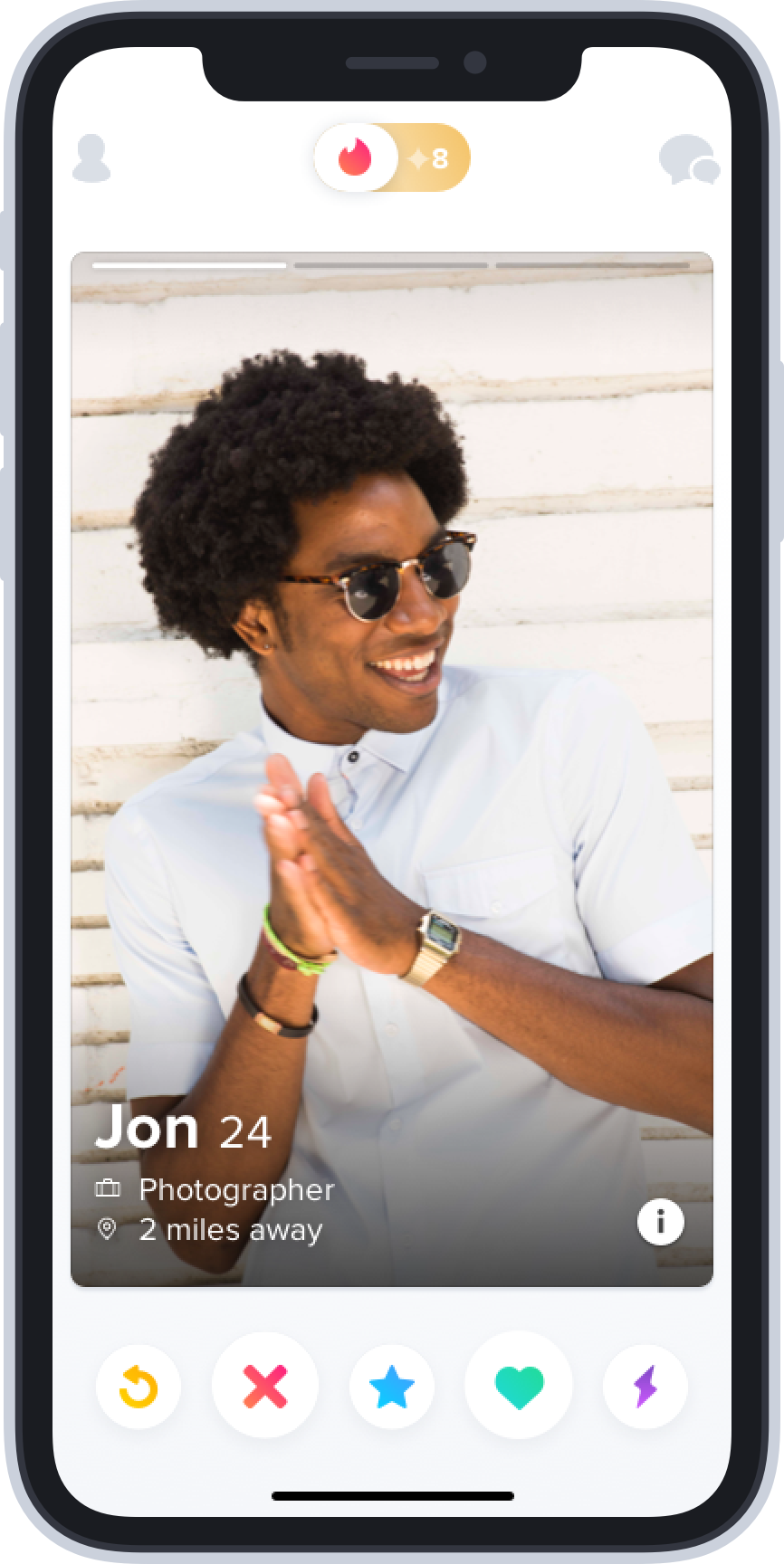
There’s a reason swipe right and swipe left have become shorthand slang for signaling approval and disapproval, generally. Tinder came up with what feels like a design primitive on a touchscreen UI for binary voting.
In this software era, true competitive advantages, or moats, are increasingly illusory. Most software features or UI designs can be copied easily by an incumbent or competitor overnight. All you will have done is test the impact of the design for them.On one of my trips to China, I was at a dinner with a large group of Chinese entrepreneurs, and I mentioned the hubbub over Instagram copying Stories from Snapchat. One of the chief product officers of one of China’s top companies laughed and remarked, “In China, if your competitor doesn’t copy one of your successful features inside of two weeks, they must be incompetent.” In many ways, the Chinese tech scene is the true Darwinian marketplace of ideas that Silicon Valley thinks of itself as. This bodes poorly for the relative output of Silicon Valley because the rate of idea spread and mutation occurs more quickly in China. Silicon Valley is often said to have taken over as the geographic center of technology innovation from Boston’s Route 128 in part because Silicon Valley’s more open labor markets allowed ideas to move freely among companies. China has taken that playbook and pushed it even further. Surviving the competitive landscape of the Chinese tech scene is like trying to climb out of that pit in The Dark Knight Rises. Terrifying.
But if you can create a flywheel, like TikTok’s, it becomes much harder for a competitor like Reels or Triller to catch up. Triller may pay some influencers from TikTok to come over and make videos there, Reels might try to draft off of existing Instagram traffic, but what makes TikTok work is the entire positive feedback loop connecting creators, videos, and viewers via the FYP algorithm.
In tech, an industry that epitomizes Brian Arthur’s Increasing Returns and Path Dependence in the Economy perhaps more than any other, the first competitor to achieve product-market fit can run away from the pack. If more and more markets feel like they are winner-take-all, or winners-take-all, that is because in an increasingly interconnected world, they are.
Bytedance is often described as the algorithm company, and TikTok has been described over the past few weeks as powered by just such algorithmic black magic. Many have gone so far as to say that TikTok wouldn’t be worth purchasing if the algorithm weren’t included.
That’s a mistake, in my opinion. Yes, retraining the FYP recommendations algorithm might take so long that some users would churn. I don’t mean to trivialize that task. But the actual magic is how every element of TikTok's design and processes connect with each other to create a dataset with which the algorithm trains itself into peak performance. No single step in that loop is beyond the capabilities of any of the many U.S. suitors. All that’s needed is an understanding of how the flywheel works and a commitment to keep every element and process in it functioning.
All around me, I encounter products or services that seem to have hit a ceiling in the quality of their algorithmic recommendations: Yelp, OpenTable, Amazon, Google, Netflix, and on and on. Don't get me wrong, some of them are at rest in a good place. But I can't help but feel there is another leap to be made in some of these, and that perhaps more algorithm-friendly design might be one of the possible solutions.
To recap, in part one of my series on TikTok, I discussed how the algorithm acts as an matching mechanism that makes TikTok such a scalable entertainment network. In comparison, social networks have to approximate an interest graph using a social graph, with all the problems that come with that. In this second piece on TikTok, I’ve focused on how its design helps its machine learning FYP algorithm “see” what it needs to see to do its job so effectively. An algorithm-friendly design ethos may become a model of how other companies in other verticals might achieve an edge in the age of machine learning.
But there’s one final reason I find TikTok such a fascinating and anomalous case study. It has to do less with software and algorithms and more with something that the cultural determinist in me will never tire of studying: the network effects of creativity. That will be the subject of my third and final part of this series on TikTok.