The New Face of Composable Finance
An in-depth look into our brand evolution
Disclaimer: Information as of Nov 9, 2022. For the most recent updates, dive into our comprehensive documentation here.
At Composable Finance, we embody design thinking in all of our building procedures. By doing this, we own our designs as a fundamental factor in both product development and our style of conveying our vision through communication. Over the past few months, we have conducted a series of internal workshops with our team to redefine and consolidate our vision which has resulted in an updated mission and vision statement for Composable:
Vision: Composing DeFi for Mass Adoption. Any money, any chain, anywhere.
Mission: Pioneering innovative web3 user experiences in a trustless, non-custodial, and decentralized manner.
The story that rooted our brand
From the onset, the Composable brand identity was defined by our artistic insights, collectively shared across the team. Picasso, the name we adopted for our Kusama parachain and its testnet Dali and even our cross-chain DEX, Pablo bear evidence to this. Our decision to use the creativity of notable artists in our brand identity and the way we explain our technology was indeed a decision informed by purpose — a blend of creativity and artistry powered by the innovations that we are building in web3.
It is clear that the underlying narrative for the team is to really power creative innovation, both in practice and in ideation. For this reason, the brand should be deeply rooted in the artistic distinctness that Composable has become synonymous with.
Initially, we set out to define the Face of DeFi’s future which allowed us to convey our initial message of interoperable DeFi. In retrospect, we noticed that our vision had outgrown our design, necessitating the need for us to apply the same scalable architecture to design as we are doing for our technological infrastructure. Hence, our new design aligns with the multiple modular elements we have composed to form the new face of the Composable brand. All these accurately highlight our vision to Compose DeFi for Mass Adoption.
Visual identity <> Value sets blending
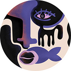
We are composing DeFi for mass adoption by orchestrating DeFi’s various elements across different ecosystems and technical architectures. We consolidated the value sets that our innovation rests on composability, trustless communication, and orchestration and have set out to not only display this in our technology stack, product and brand design, but also our messaging. Our new logo is a culmination of simple shapes that represent modules that converge to form a solid visual anchor (composability) which ultimately forms the face symbolizing the ability to communicate, express, and interact (orchestration). As a result, we have created a visual sting that represents our ethos by combining these elements into our logo, maintaining the legacy of familiarity with our community and supporters.

Our modular architecture perfectly accommodates the elements in the face, including how different modules fit together to form cohesive structures. This design mimics how our technology framework provides a cohesive landscape to execute modular functions.
Changing Faces
A face symbolizes communication, expression and interaction. Similarly, the new Composable face represents a user’s ability to seamlessly communicate their unique needs and wants across the various DeFi ecosystems. The face is both the user and the infrastructure; a symbolic convergence of the multiplicities that exist within DeFi while presenting a unified point that respects the autonomy of the respective ecosystems we are bringing together. — Zain, Former CMO
Initially, the Composable face comprised various elements that combined into one cohesive visual structure which has become synonymous with our brand. However, having one cohesive visual image presented challenges around design scalability, as we tried to proportion elements across our different product suites. After multiple iterations, we were left with two options: abandon the face altogether or enhance and simplify it. Rather, we opted for the latter.
As Composable’s narrative and technology are hinged on abstraction, we decided to apply the same design rigor to our brand by answering two distinct questions:
- How can the face be more straightforward yet continue to highlight our artistic and modular approach to web3 innovation?
- How can we impress a subtle nod to our updated roadmap and vision through design?
Hence, the new face of the Composable brand is now vectorized, forming solid shapes as we did away with the simple lines. Just as our technology abstracts the complex UI/UX of DeFi, our brand has now abstracted its design to allow for seamless incorporation across our various products. Additionally, as a result of the change, the face now incorporates a variety of colors which will be highlighted throughout Composable’s branding, design, and products.
Composing colors
We composed four colors to create our core-color pallet for the updated Composable brand: violet-blue, orange, charcoal, and pink. Additionally, we utilized several other color accents for flexibility, variety, and scalability.
We chose violet-blue as our new primary color. Violet is a deep, artistic, mystical and royal color, while blue signifies calm, seriousness, and intelligence. Our decision to mix the two was to demonstrate our artistry and our sense of innovative purpose at Composable. Orange, our secondary color, contributes nearly as much to the visual effects as the primary color. We added it to our pallet because it gave our design a confident, strong character when we appropriately applied it in highlighting and lighting. In combination with the deep violet-blue, the orange highlights create strong, assertive, and daring visuals that should captivate the viewer. Charcoal black, chosen as a base for the background color, helps accentuate the colors and allows the usage of highlights and light. Pink is used as a hue that derives its origin from purple, and we employ it to offer color hierarchy variety. Finally, we chose an off-white cream color for the text; Mukta for body texts and Cita Pro for titles to blend it all together. The off-white cream color gives it an artistic feel that matches our brand personality.
Composable: Defining our legacy
The artwork depicted below is a reference to the artistic images in our new website, a calm and refreshing style within itself that is inspired from a variety of modern and postmodern artistic influences.

Building an enduring brand is a journey; one that entails prioritizing coherence rather than simplified consistency. While consistency may mean sticking to the same elements of a brand over time, coherence prioritizes how a brand feels to the user, how the experience over appeals. Brand coherence is rooted in clarity. At Composable, we continue to demonstrate our commitment towards unparalleled user experience. Hence we have aligned our new visual identity to be coherent with our vision.

The culminating highlight of our updated brand is in tandem with the release of our new website, marking the incoming product and innovation milestones. Welcome to a new era — any money, any chain, anywhere.
For more information about Composable and how it is architecting the unified DeFi landscape of the future and composing DeFi for mass adoption, check out our socials:
Twitter | Telegram | Discord | Website | GitHub | LinkedIn | Youtube