The app for independent voices
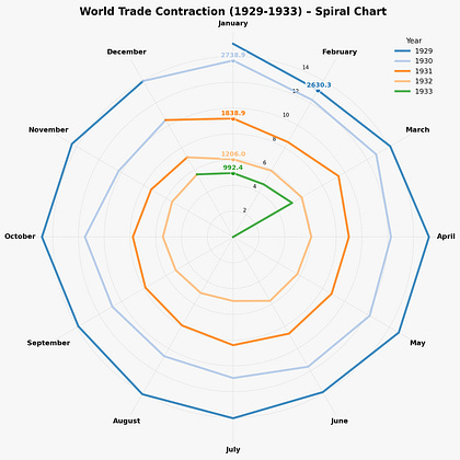
Just finished recreating one of economics' most haunting visualizations—Charles Kindleberger's famous "spiral" chart that shows global trade collapsing like "water circling a drain" between 1929-1933.
Why this matters now: Kindleberger's concept of the "leadership gap"—when no country steps up to stabilize the global economy—feels incredibly relevant today. Economic stability isn't natural; it's a public good that requires active maintenance.
The viz itself: Created in Python using polar charts (trickier than expected!). I added color coding by year to better show the trade collapse progression. Sometimes the best datasets are small enough to just type into Google Sheets.
The warning: History is pretty clear about what happens when we choose economic nationalism over global cooperation. The spiral doesn't lie.

