The app for independent voices
How to make an org chart that’s more engaging and interactive
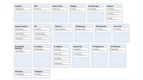
Org charts can sometimes be difficult to navigate. They often contain several departments and organizations, creating clutter and making it difficult to extract information at a glance. Additionally, they can be difficult to maintain with employee turnover, promotions and organizational changes.
A data-driven diagramming tool can make this type of classic visual document more functional and interactive. In this article, the Lucid blog exploring several ways to do that.

Oct 19
at
2:15 PM
Log in or sign up
Join the most interesting and insightful discussions.

