The app for independent voices
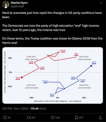
This may be the most fascinating chart I’ve seen yet with regard to the election. The author of the tweet is a data journalist.

Nov 8, 2024
at
1:13 AM
Log in or sign up
Join the most interesting and insightful discussions.
