The app for independent voices
Darkest Before Dawn in progress.
Fresh mock-up.
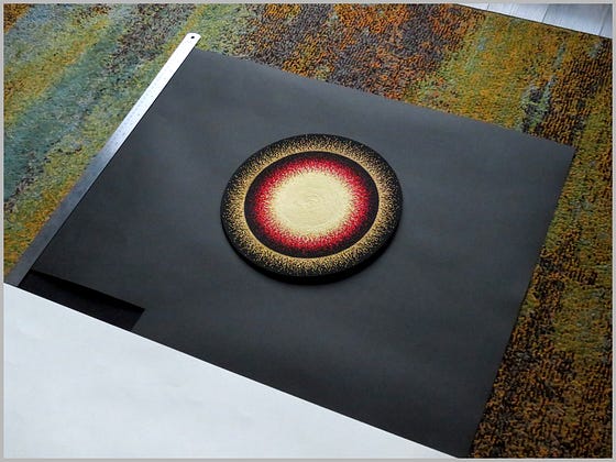
Here’s the finished 12” appliqué against a cardboard background the size of my panel (24” x 30”).
The final painted canvas background will be darker, and much less reflective. The intended effect is one where the beadwork looks like it melts into the background.
✧ ON COMPOSITION
I won’t be centering this medallion – not exactly.
For some reason, that never works very well. A perfectly-centered circle on a square or rectangular background will tend to look flat and harsh. There’s a lifelessness to it. No good!
Composing this kind of piece is deceptively simple.
A horizontally-centered circle sings if it’s slightly higher than the vertical middle – but how much lift it needs relative to the true center is usually an open question. That distance may vary depending on design elements at play, especially those on the edges.
Obviously, there are no hard, fast rules for me to follow here.
Hence the decision-making stage documented in this picture.
This is the moment in the process where I move things up or down by a quarter-inch, fuss, take pictures, pace back and forth, stand on my head, fuss some more, and call my mom.
I’m half-kidding. It’s not that epic a montage.
Still, small increments do make a big difference; it can take a while to find the exact spot where the thing wants to go; and I do call my mom. (She’s got a killer eye for this kind of thing.)
When the placement’s right, it’s right, and we both know it.
Next up: stitching this thing to its final canvas backing.

