The app for independent voices
My submission for Patrik L ‘s Minimalism challenge.
I’m a big fan of less. But I prefer to find things that leave lots of space, rather then editing things to manufacture space.
Not that there’s anything wrong with that. I admire folks who can do it. It’s just not my thing.
I thought I’d actually include some text this time. The following images, which are notin submission order, are titled as follows:
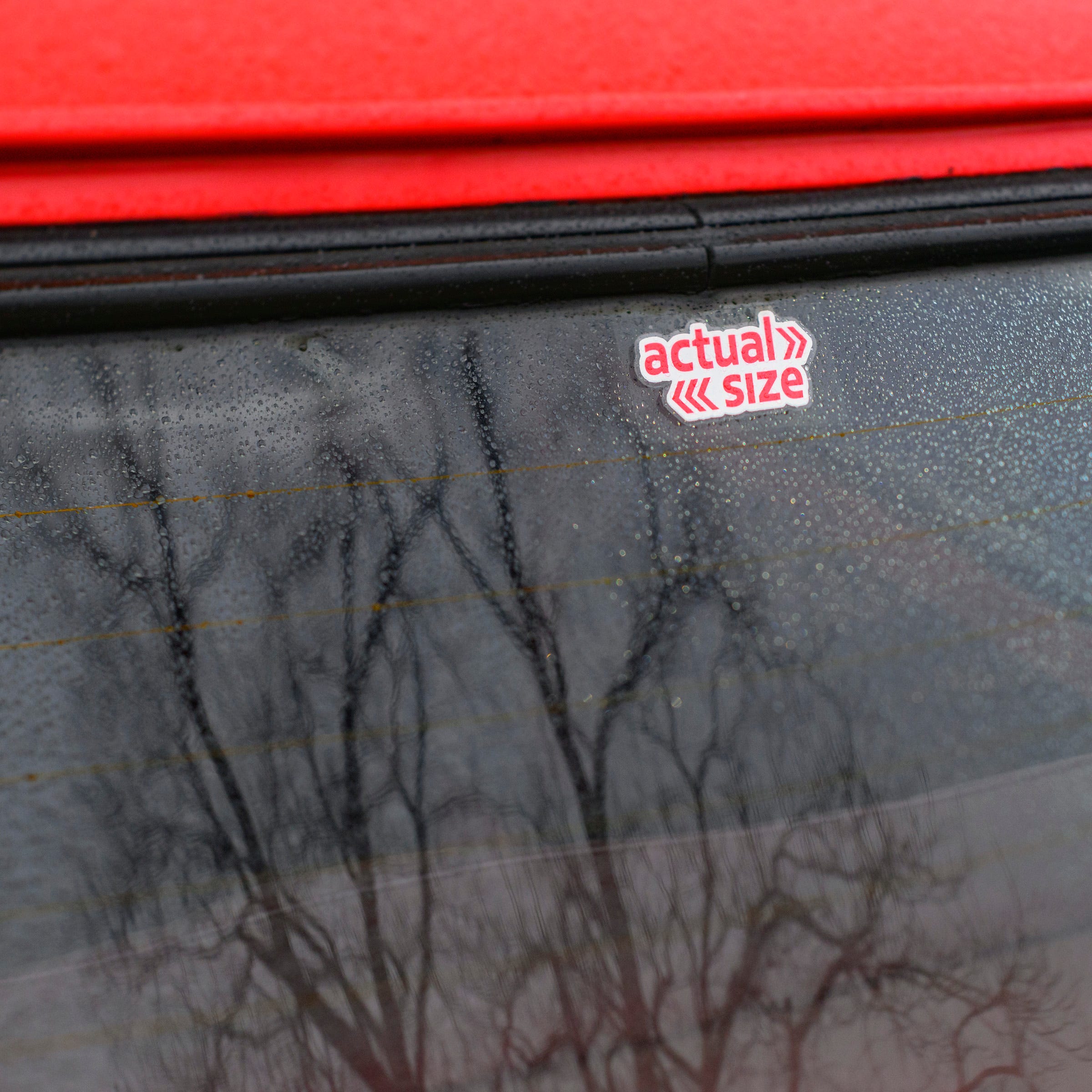
1) Actual Size - found on a Mini Cooper at an auto meetup. I Like the context provided by the reflection and the edge of the windshield. Being a former Mini owner, I think the sticker is hysterical. If you can picture a Mini, hopefully you’ll enjoy the humor as well.
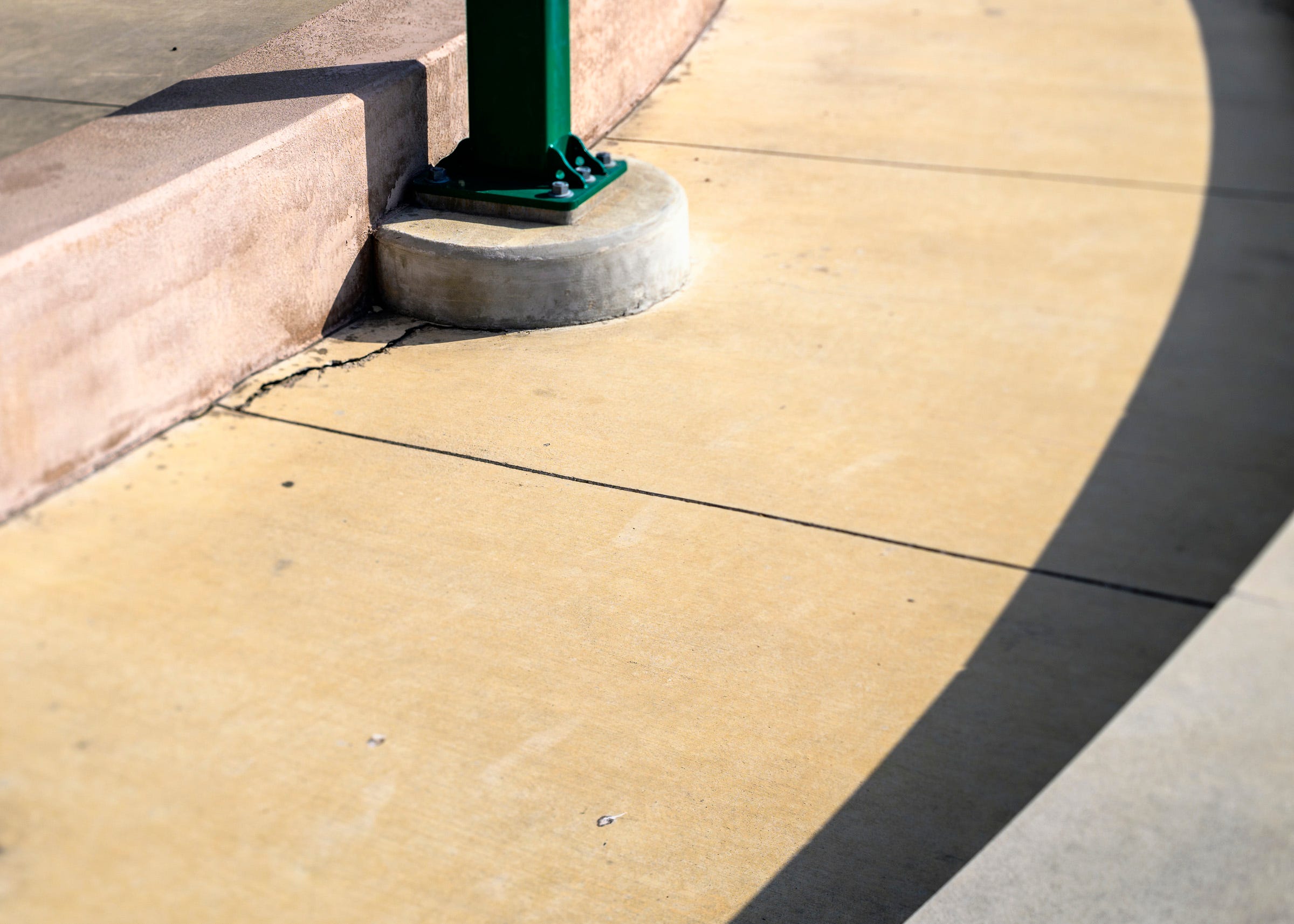
2) Walkway - we don’t consider how important boundaries are for a path. I wanted to suggest the extent of the sidewalk, along with the lighting, but focus on the space afforded therein.
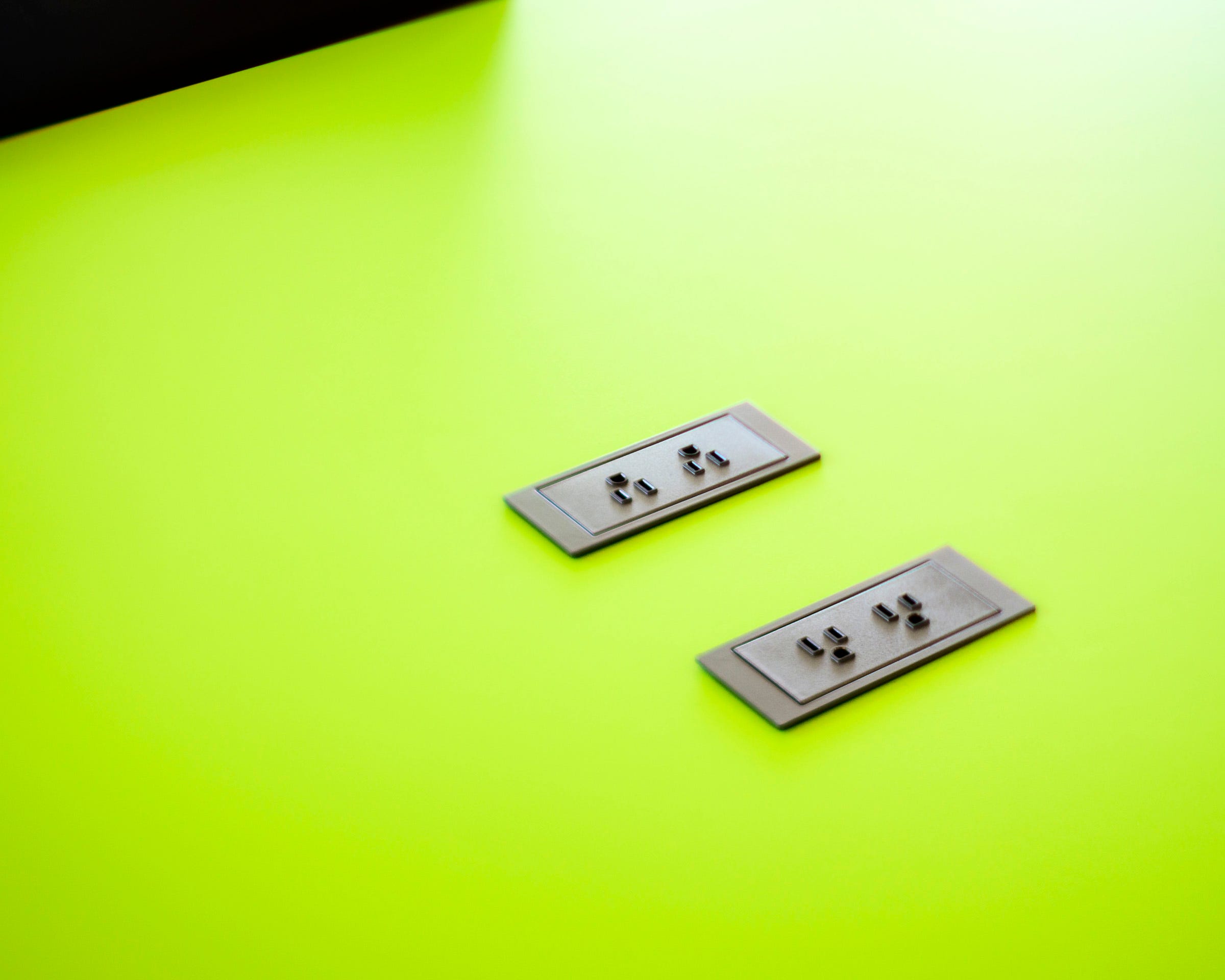
3) Connection - Power ports (in the US) in a desktop. A workspace in a library where one can get away from distractions, yet retain access to something now critical in so many ways.
4) No Looking Back - an abandoned truck in a field in New Mexico. I found the lack of a rear-view mirror metaphorical for the state of the vehicle.
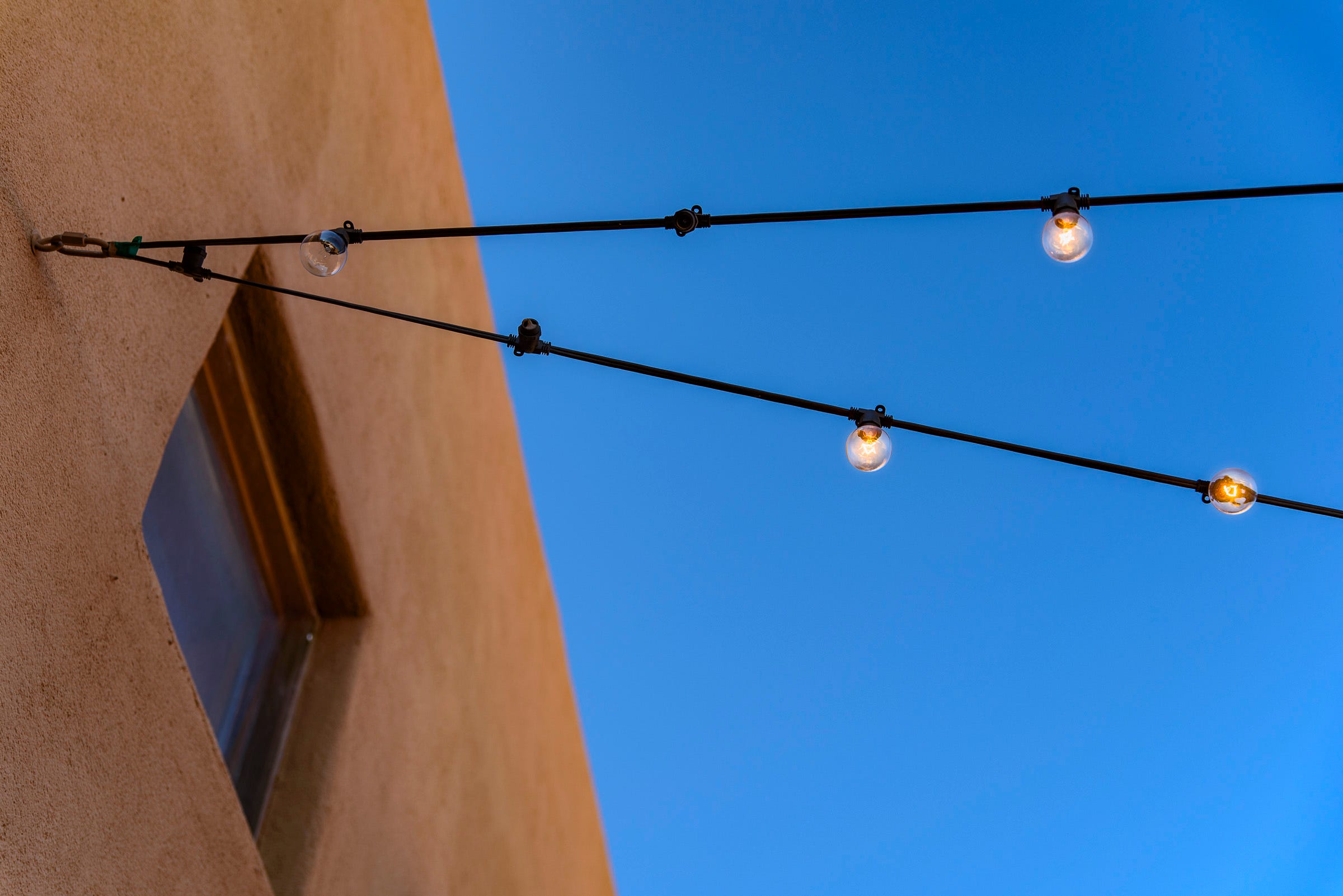
5) Al Fresco - Santa Fe architecture is all about shapes and colors. I wanted to play off of both the building and sky, and include the (partially working) light wires simply because of the geometry.


