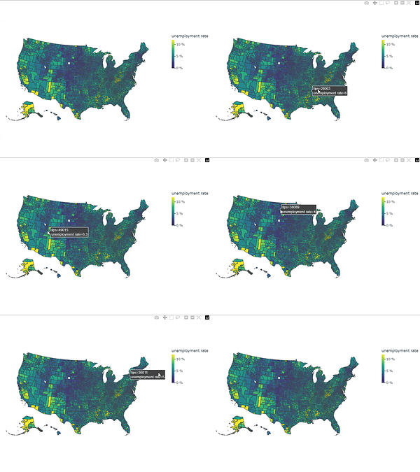
Create interactive geoplots of the US with a single command in Python.
The Plotly package makes this simple - see their guide: plotly.com/python/choro…
For example, if you have unemployment data at county level, you can use px.choropleth() to plot it in a map:
fig = px.choropleth(
    df,
    geojson=counties,
    locations='fips',
    color='unemp',
    color_continuous_scale="Viridis",
    range_color=(0, 12),
    scope="usa",
    labels={'unemp':'unemployment rate'}
)
It even deals with positioning Alaska and Hawaii underneath mainland US which is usully pretty tricky.
I’ll be covering how you can embed interactive Plotly maps in a website/landing page in a future post.

Oct 28
at
3:03 PM
