The app for independent voices
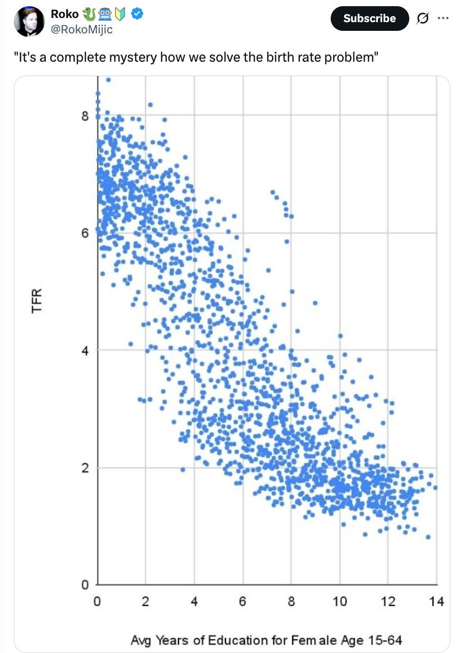
So there’s this graph floating around that supposedly shows a relationship between years in school and total fertility rate (TFR). The graph is weird—it’s clear that there are a lot more dots in the graph than there are countries—so Nicholas Kircher and I decided to look into it.
Roko clears it up In his comments section: One of Roko’s commenters challenges him on the graph and he explains that the basic “unit” of the graph is Years within Country. So, for example — a country like Angola, if it has measurements for 25 years, gets 25 dots on the graph.
But that kind of data hides some pretty big problems. What you’re seeing in Roko’s graph is driven by at least two trends. One is the differences in education between countries. The other is the temporal effect—since 1960, birth rates have gone down and education has increased. It creates a sort of “temporal smearing” effect.
This is a problem because if two variables are changing over time in a simple, uniform way, the “smearing” effect will occur regardless of whether they are actually related, and it will make the final relationship in a graph like Roko’s look stronger than it actually is.
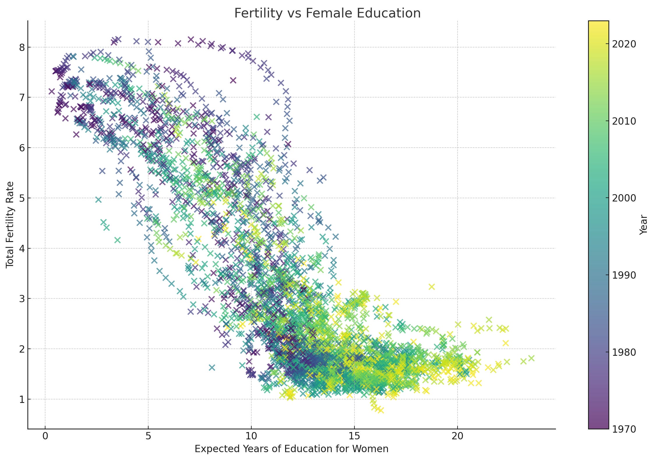
I’ve graphed a second version of similar data (the X axis here is expected years of education), with the dots highlighted by year, and you can see the smearing effect—the yellow dots cluster toward the bottom right.
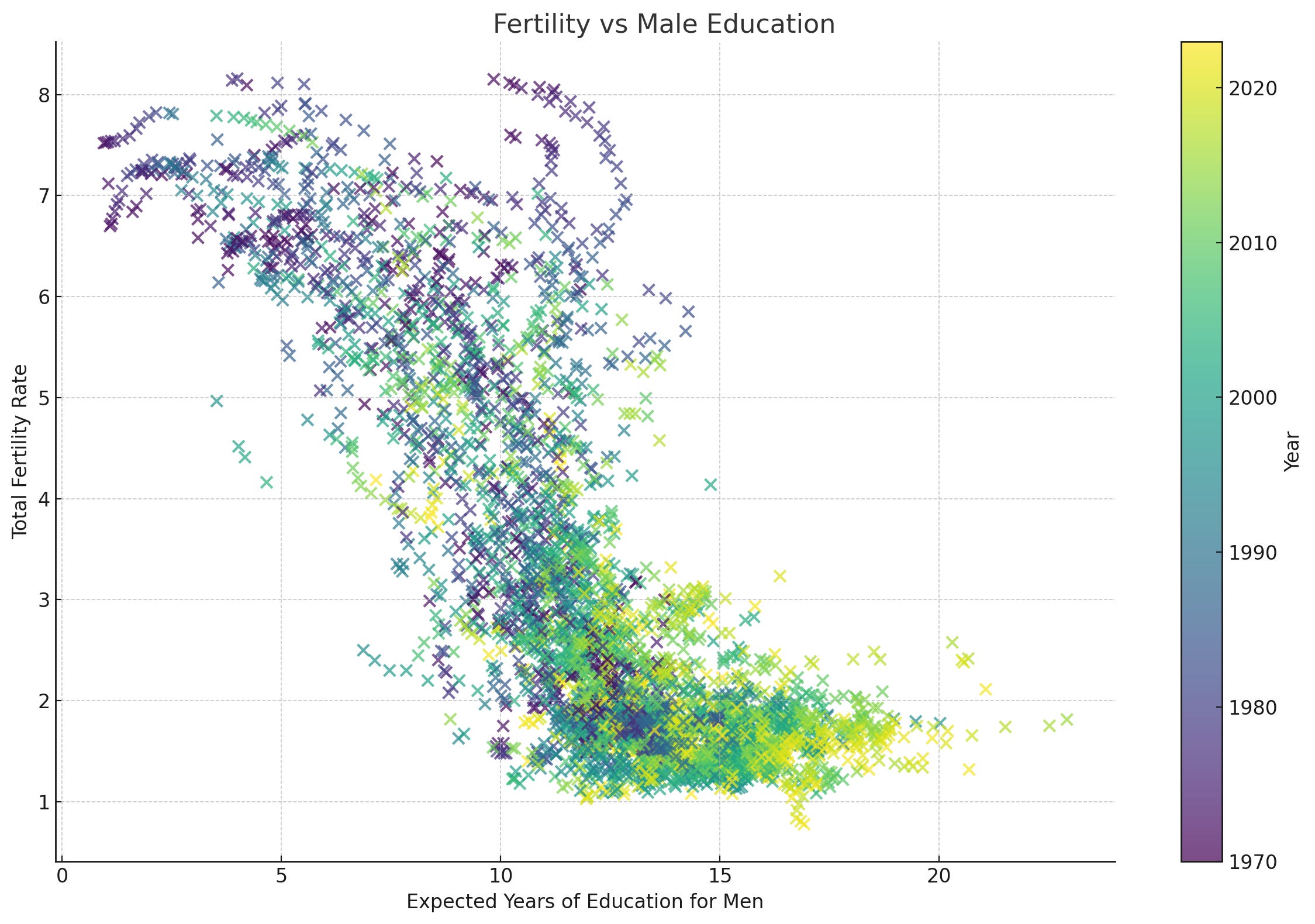
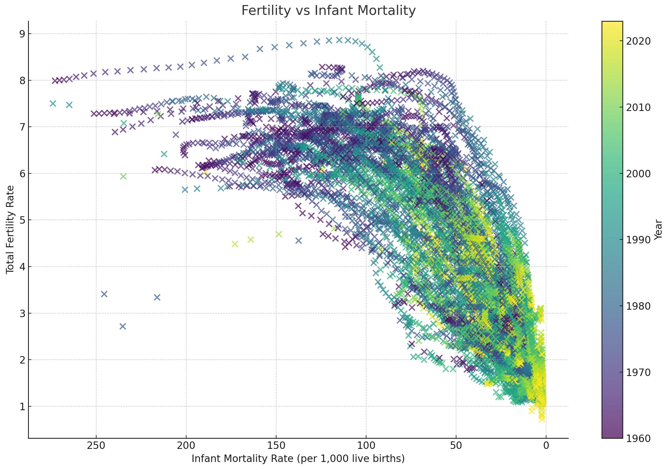
For comparison I’ve also graphed two more variables—infant mortality, and education for males. You can see that they trace similar (or similarly dramatic) shapes.
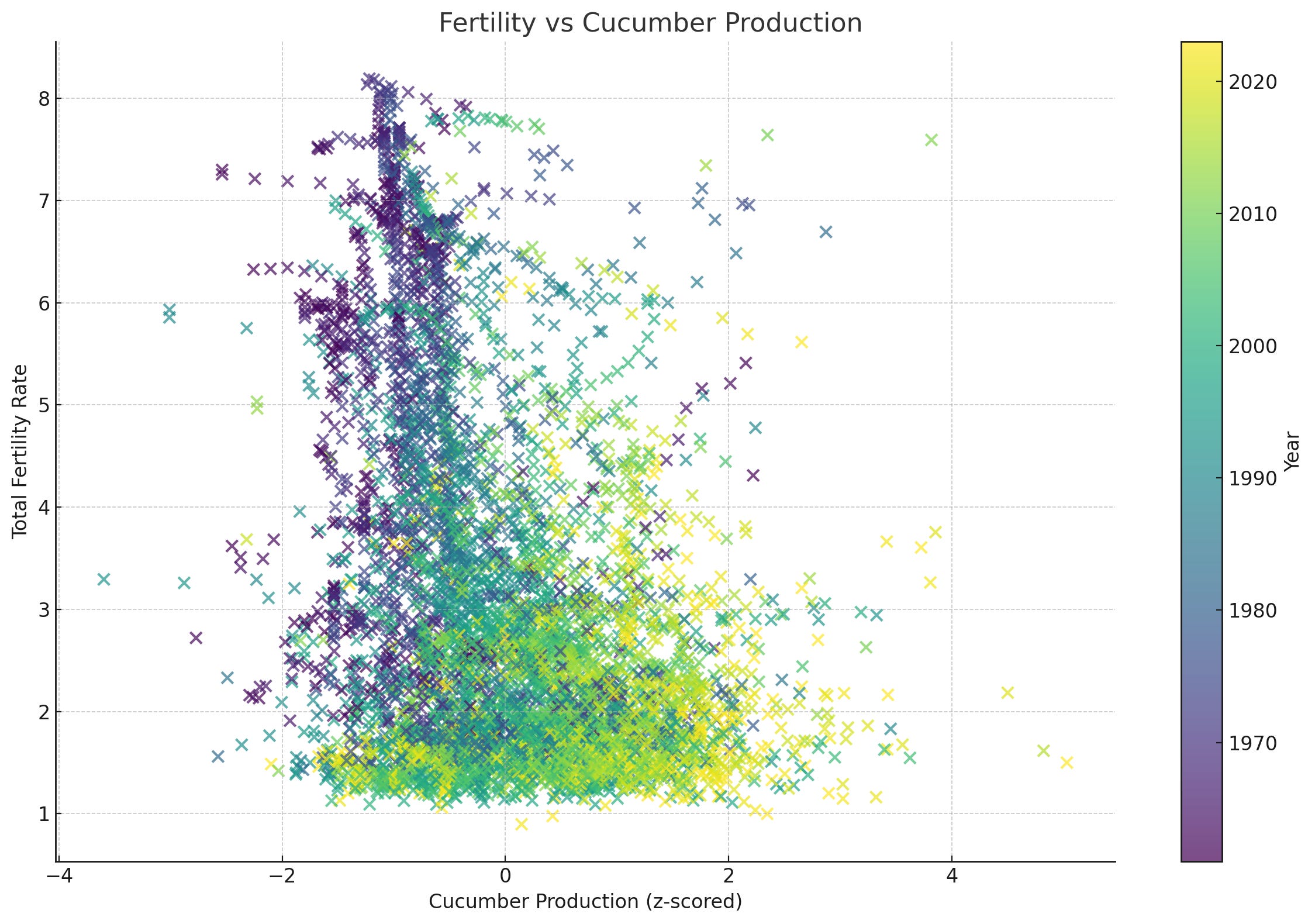
And, for the fun of it? I’ve graphed another variable—increase in Cucumber production (standardized within country) since 1960. Note how TFR appears to drop alongside an increase in the Twitter male’s natural competitor for female attention—oblong vegetables.
The last one is ridiculous, for sure (and, in fact, the statistical relationship shown in the graph is much weaker than the others). But it just illustrates what happens with this whole temporal smearing thing. Over time, cucumber production increases within country because economies are getting better. Also, over time, TFR drops. When you graph multiple years for each country, the fact that the two trends are co-occurring makes the variables look like they’re related. Are they? Possibly, I guess. But whatever relationship is there is probably exaggerated by this temporal effect. We’re looking into it.
Sooo… what’s the story here? Dunno. But it’s a lot more complicated than Roko’s graph suggests. Nicholas Kircher and I are writing up an article on this now — it’ll feature on Moonshots and the CommaDash blog. We’ll see how far we can chase it, ‘cuz data analytics is sort of our deal.
I’m looking forward to writing more about this.
