The app for independent voices
The Map That Tries to Explain the World
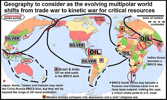
This post — “The Global Resource War Is Going Kinetic” — is built around one image:
Article: substack.com/browse/wor…
At first, the map looks like chaos — arrows, borders, resource icons everywhere. But step back and it’s not predicting war. It’s doing something subtler:
It’s teaching us how to see power — as corridors, chokepoints, and resource clusters that states now treat as security priorities.
Useful? Yes. Complete? Not even close.
The map can’t show the human side — politics, migration, inequality, or how technology reshapes everything. It frames the world as a competition for oil, metals, and routes… and leaves out almost everything else.
Still, it’s a reminder:
Maps don’t just describe reality — they quietly tell us what to pay attention to.

