Learn to align your content
Why the layout of your content matters, tips from a design master, Shutterstock’s best colour combinations, an amazing new storyboard tool and promoting your content on new platforms
When you communicate your factual story, you will not just be speaking it, you will most likely be publishing it. So unless it’s an audio production, it’s important your published content looks good. If it doesn’t, you’ll lose your audience, and undo all your good work in creating your story in the first place.
When you publish your content, whether that be a document, report or presentation of some kind, a website or a video or film, consider the principles of layout and composition, which form the foundations of good content design.
These provide structure to your content and will help your audience navigate their way through your factual story. Information presented clearly and logically will be read or viewed more quickly and easily, be better understood and retained in the memory.
Layout and composition can include text, images, graphics and negative space, where there is little or no content. There are countless ways to compose and layout these elements. But as you create your own factual content there is one fundamental technique you should always use, and that is to embrace and utilise alignments and grids.
Most people don’t notice how much of their content is aligned, because often it is done so automatically. Whenever you create a document or write an email, the software you are using automatically aligns the text.
But you should pay attention to how the visual elements of your content are aligned, and be consistent.
That means placing the tops or bottoms of images and blocks of texts along the same lines, and creating equal spacing between elements and lines. It could mean centring images and text that have a relationship to each other, so they look even and balanced.
Create equally spaced margins and use the same margins on all your pages or slides.
A good tip is to overlay a grid onto your content. If your content creation software doesn’t allow this, try to imagine a grid and use your eye to line up items. Try to ensure all your content elements fall into a regular pattern on this grid, consistently appearing in the same places relative to each other, and aligned to each other.
Take our lesson ‘Why layout matters’.
Tips from a design master
Continuing the theme about the importance of good design, we recommend you listen to the School of Motion podcast - particularly the latest episode which offers a number of excellent tips about how to improve the design of your work.
School of Motion teaches animation and motion graphics, but many of their podcasts are useful to all those communicating their work. In their latest podcast, the School of Motion chats with design master Brady Erikson, who offers a numbers of tips you can use to amplify your own projects.
These include
Delving into colour theory and experimenting with different colour settings to enhance your design work.
Continuously evaluating your designs from different perspectives. Use techniques like zooming in and out, flipping the design, and adjusting saturation to assess the composition and balance of your work. This practice can help you identify areas that need improvement and enhance the overall quality of your designs.
Embracing iteration: accept that perfection is rare in the initial stages of design. Embrace the iterative process of refining and adjusting your work. This mindset will help you overcome discouragement and lead to better design outcomes.
Experimenting with blending modes: Brady highlights the potential of use blending modes in software such as Adobe’s Photoshop, Illustrator or After Affects to achieve creative results, unique effects and add depth to your designs.
Capturing real-world textures: incorporating textures from the real world can add authenticity and emotion to your designs. Brady suggests taking the time to photograph textures yourself, experimenting with different objects and lighting to create unique effects.
Shutterstock’s best colour combinations
To help you explore colour, and if you’re looking for some design inspiration, it’s worth checking out a new round up by image library Shutterstock.
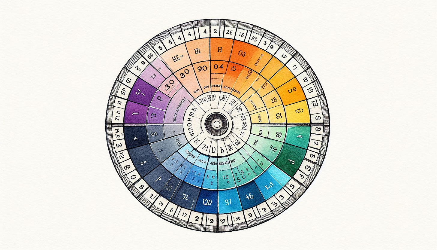
The colours you use in your designs, presentations, reports and websites are important. They set the tone, engage viewers while also shaping their perceptions of who you are and the work you’re communicating. You can learn more in our lesson Use Colour Theory.
To help, Shutterstock has created 101 colour combinations, that you can use either as inspiration or directly in your work. Each colour palette is free, and comes with hex codes, so you can be sure to be copying and using the exact recommended colour.
As well as the colour combinations, the roundup offers a quick crash course in colour theory and psychology, and segregates out its palettes into cool, bright and warm combinations among others.
Amazing new storyboard tool
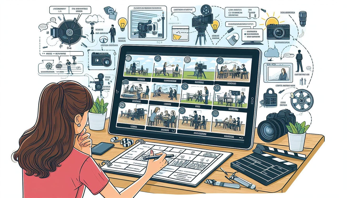
One of our key lessons at the Factual Storytelling School is that you should always script and storyboard any video or audio production, before you create and publish it. You should plan these, before putting in the significant creative and technical effort needed to produce them.
But what if you can’t draw, yet need to sketch out convincing scenes in a storyboard to share with colleagues and clients?
We’re very pleased to recommend an amazing new tool you can use to do just that.
Created by David R Smith, Storytribe is a new platform for storytellers that aspires to be the world’s best storyboarding tool.
Storytribe provides a library of ready-to-use graphic assets and scene props. It allows you to create stunning illustrations and storyboards effortlessly. No drawing skills needed. You can customise characters, props, backgrounds, and speech bubbles in minutes, via an easy to use user interface. Find out more here.
See our lesson Why You Must Script And Storyboard for much more on how you go about it structuring your next video or audio show.
Promoting your content on new platforms
We like to recommend other useful writers and content creators whose advice may help you create, publish and promote your factual content to audiences.
This week, we suggest you take a look at writer David McClory, who offers a wealth of valuable insights into how to write, and as important, get noticed.
In his newsletter this week, David shares tips about how best to utilise under-saturated platforms, where your content has a better chance of getting noticed.
David produces The Solopreneur Stack newsletter on Substack, which you can subscribe to here.


