Discover more from Data according to me...
Optimizing Workflow with Self-Service BI Tools: How Self-Service BI Tools Drive Efficient, Insightful Decisions Across Teams
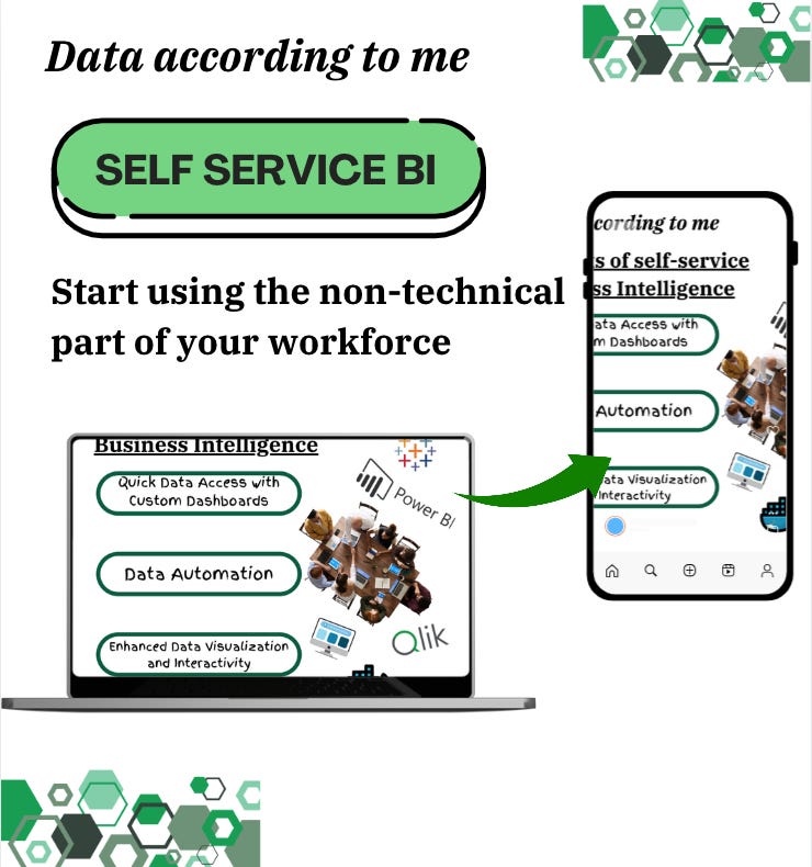
Let me tell you about SELF-SERVICE BI
Business owners, organizations, decision-makers, and analytics teams are always requesting data and sometimes experience an unnecessary waiting period for data reports with constant back-and-forth with technical teams. Making data accessible to everyone, not just the experts, can reshape workflows, improve decision-making, and help teams make impactful choices faster than ever. It can shift the data culture within an organization and create a data-literate workforce.
Let me tell you about self-service Business Intelligence (BI).
It transcends traditional data access. It enables customized, on-demand insights through intuitive interfaces, automation, and dynamic visuals, making self-service BI tools a catalyst for transformation.
Why Self-Service BI?
You’re wondering: What is Self-service BI? Is this another buzzword? I don’t want to make this another long article you skim over but let me put it this way:
Imagine that YOU are a marketing manager who needs last quarter’s customer insights to finalize another campaign strategy (this is the easiest one I could think of).
Instead of requesting data from IT and waiting days (or weeks!), they can use a dashboard, developed by the analytics team, and gain instant access to the information they need.
Self-service BI makes this possible by removing barriers to data access and letting users explore, analyze, and visualize data independently.
Self-service BI tools aren’t just about access to data; they’re about democratizing insight and giving people a direct role in the analytical process. When we shift from gatekeeping data (some data should be gate-kept), and there is direct access to data, decision-making becomes agile, strategic, and grounded in accurate insights for teams that use data.
Key Benefits of Self-Service BI for Workflow Optimization
1. Quick Data Access with Custom Dashboards
As mentioned earlier, in traditional settings, data queries go through technical teams, which can create delays. With self-service BI, every team member can create tailored dashboards that update in real-time, teams can skip the traditional request-and-wait process and move directly to analysis and decision-making. These dashboards pull from centralized data sources, giving each user a live view of the metrics most relevant to them. This is already a competitive edge.
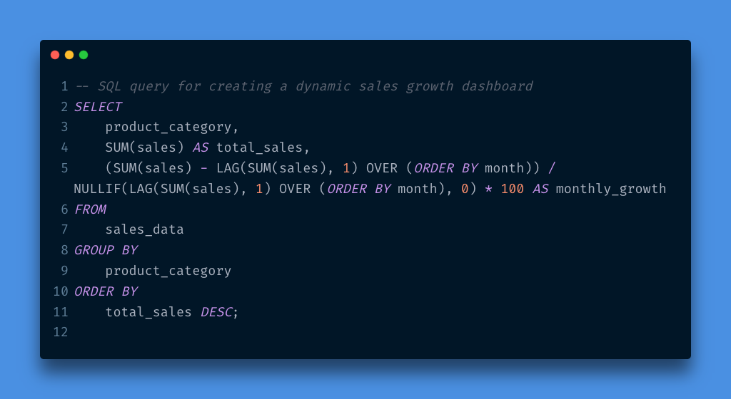
For example, Tableau enables real-time sales tracking, with dashboards updating as data flows in, while Looker provides detailed insights by merging multiple datasets. Teams can set up SQL-based calculations or drag-and-drop visualizations for tracking key performance indicators (KPIs), transforming raw data into actionable views.
* This query can be useful in a BI team to show the growth trend of each product category month-over-month and provide quick insight that shows which categories are growing or declining.
2. Data Automation
Self-service BI can reduce repetitive tasks by automating routine data pulls and alerts.
I am a complete believer in automation. Automation can reduce a 40-hour task to 2 hours and create time for tailoring recommendations that are human-centered, and I cannot emphasize how important this is. This article demystifies automation.
Many BI platforms allow users to schedule data refreshes and set thresholds for important metrics. For example, a finance team receives automated alerts when expenses exceed budgeted limits — no manual check-ins required, automation. You don’t need to write queries every week to check this, because automation is in place.
With Power BI or Google Data Studio, teams can set up automated alerts tied to specific metrics, freeing time to focus on analysis rather than data collection. This process is great for optimizing workflows
3. Enhanced Data Visualization and Interactivity
Visualization is a powerful component of self-service BI, transforming complex datasets into digestible insights. Tools like Power BI, Qlik Sense, and Looker offer interactive elements — filters, drill-down capabilities, and dynamic visuals that let teams explore data from multiple perspectives.
An operations team tracking supplier performance can use Power BI’s drill-through feature, to view high-level data and drill down to specifics like supplier lead time, cost fluctuations, or regional performance. These insights reveal patterns that help inform purchasing decisions and highlight potential areas for efficiency improvement.
Common Tools for Self-Service BI
There are so many tools out there, but these are some of the popular ones that simplify data analysis and collaboration, and prioritize usability and accessibility without compromising analytical power:
Tableau: With intuitive dashboards and drag-and-drop features, Tableau allows users to easily visualize data. For instance, a sales team can track performance metrics over time and set custom alerts when values hit a certain threshold.
Looker: With a user-friendly interface and powerful integrations, LookML helps teams build custom reports and explore data visually. Marketing teams often use Looker to monitor KPIs like customer acquisition costs or campaign performance in real-time.
Microsoft Power BI: Built for seamless integration with the Microsoft ecosystem, Power BI is ideal for teams already using tools like Excel and Azure. Power BI’s ease of use means teams can create custom visuals to track business-critical metrics.
Qlik Sense: Strong in interactivity, Qlik Sense uses an associative engine that lets users search and explore data connections intuitively.
These tools are built for all types of users — no need for a degree in data science. Offering drag-and-drop functionalities, custom dashboards, and dynamic visuals opens up data access to non-technical teams.
Getting started:
Optimizing your workflow with self-service BI is less about a “tool” and more about the mindset.
Here’s a quick roadmap for getting started:
Step 1: Identify Your Key Metrics
Before diving into any BI tool, you must know what data matters most. Remember, you may not be an analyst, but you must understand your KPIs. For a retail team, it might be daily sales, customer churn, and inventory levels. For marketing, it could be campaign engagement rates and customer acquisition costs. For a product launch, it could be budget and target audience. Knowing what data to measure helps you focus on valuable insights and not worry about sifting through so much data.
Step 2: Choose the Right Tool
What tool meets your team’s needs? Are you looking for flexibility in data visualization (like Tableau) or efficient integration with existing software (like Power BI)? There are some options to try — many of these platforms offer free trials for 7–14 days.
Step 3: Empower Your Team with Training
No matter how intuitive a tool might be, proper training is key. Host introductory sessions and create a self-service BI user guide. Show teams not only how to navigate the tools but also how to interpret data effectively.
Step 4: Build Custom Dashboards for Immediate Insights
No one size fits all. Customizing dashboards for different teams needs to help with proper information. A sales team might need metrics updated hourly, while a marketing team may want insights on weekly campaign performance. Dashboards can be as unique as the teams that use them, providing real-time insights tailored to specific goals. You can read about mastering the dashboard design process here.
Step 5: Set Up Alerts and Automation
Many BI tools allow users to set alerts for key metrics. For instance, setting a threshold for sales performance or inventory levels can prompt automatic notifications, enabling quick action when necessary.
Here’s a basic example in Python to automate pulling data from a BI tool API (like Looker) and generating alerts:
import requests

# Replace 'your_api_endpoint' with actual Looker API endpoint and 'YOUR_TOKEN' with your API token
response = requests.get('your_api_endpoint', headers={'Authorization': 'token YOUR_TOKEN'})
data = response.json()

# Set threshold for sales performance
for record in data:
    if record['sales'] < 1000:
        print(f"Alert: Sales below threshold for {record['product']}")
With such automation, teams can save hours of manual checks, making workflow optimization practical and effective. Remember automation saves time…
Practical Impact of self-service BI
Let’s take a look at a practical application. A healthcare organization, implemented Looker to monitor patient admission trends and resource allocation across facilities. By setting up a self-service dashboard, clinical teams could monitor bed occupancy, staffing requirements, and patient intake in real-time. This transparency led to improved response times, with admission teams able to adjust resources on the fly during peak periods. The time previously spent on pulling data was reduced by 60%, directly impacting patient care quality. Clinical teams don’t have to wait weekly or monthly to get these updates, self-service BI helps with live monitoring.
A Data-Literate Workforce
Organizations that invest in data literacy — teaching employees to work with self-service tools, ask the right questions, and interpret trends — gain a true competitive advantage.
To enable a data-literate workforce, consider rolling out training sessions that go beyond how-to basics. Effective self-service BI adoption involves teaching teams the principles of data analysis and critical thinking, transforming them from passive consumers into active participants in data-driven decision-making.
Workflow optimization through self-service BI tools is more than a technological upgrade; it’s a strategic shift for quick and insightful decision-making. When we bring data into the hands of every team member, we democratize insight, accelerate response times, and pave the way for innovative, informed choices.
As organizations embrace this transformation, the benefits go beyond faster workflows — they create a culture of data-driven empowerment that’s both resilient and adaptive. And in a world where data is often our best asset, empowering people with self-service BI tools may be the most valuable decision we make.
Be data-informed, data-driven, but not data-obsessed — Amy
Thank you for reading. I hope this edition of “Data According to Me” inspires you to embrace the human side of data.
Biz and whimsy: https://linktr.ee/ameusifoh
🔗 Connect with me on LinkedIn and GitHub
Did you find this interesting?
📈💡 Join us for weekly doses of connecting data and people, where numbers connect us and insights fuel our growth! 🌟
#DataScience #DashboardDesign #DataVisualization #Analytics #Tableau #PowerBI #Looker #GoogleStudio #Automation #ProductivityHack
Data Enthusiast | Spreadsheet Advocate | turning data into useful insights


