In Part 4, I argued that the rise in home prices from November 2018 (when mortgage rates previously peaked) to August 2022 can be entirely explained by rising rents and that the correlation with interest rates is spurious.
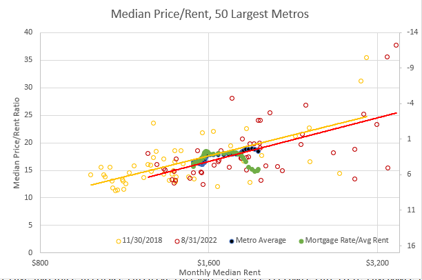
Figure 1 is from that post. Each dot represents the median rent and price, according to Zillow, of homes in each of the 50 largest metros. My argument is that since at least the 1990s, rents in various cities have stopped being mean reverting. Rising rents are from our peculiar 21st century commitment to urban housing privation, and so where rents are high and rising they are expected to keep rising. This means that where rents are high and rising, home prices rise even more - like a growth stock trades at a higher Price/Earnings ratio than a mature stock does.
In figure 1, the way this shows up is that at any point in time, cities with higher rents also have higher price/rent ratios. (This is a major source of confusion among economists that blame loose lending, etc. for high home prices, because they think prices have become unmoored from rents, when, in fact, systematically, higher rents are driving the higher price/rent ratios.)
And, as you can see in Figure 1, price/rent ratios were higher in August 2022 generally than they were in November 2018. As you can also see clearly, the relationship between price/rent and rent has really not changed at all. We are back at this tricky situation, where it looks like there has been extra price appreciation, but it could be all driven by rents.
I also stuck an inverted measure of mortgage rates on that graph too, to show how during the time that it looked like low interest rates might be pushing up home prices, rents were rising so steeply that rents can explain the change in prices without any help from interest rates. I would argue that prices don’t need to decline when interest rates rise if they never rose because of interest rates to begin with.
Aaaaanyway, I’m sure for many of you, this is hard to swallow. I can understand that. So, I’m going to poke around this issue some more and see what we find.
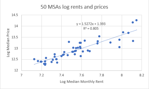
First, in Figure 2, I show the log median monthly rent and log median home price in the 50 largest metros currently. The point of this, again, is just to show how strongly rents and prices correlate, and how positive the feedback loop is. For each 1% rise in median rent, an MSA has 1.5% higher prices (according to Zillow), and the correlation is 81%.
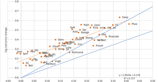
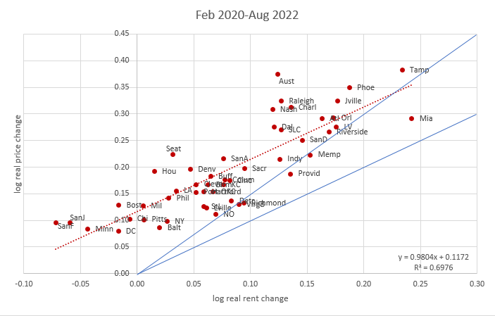
Figure 3 shows changes in rents and prices (adjusted with CPI ex Shelter) from the start of Covid to the most recent data. On the graphs below, I have included a 45 degree angle line which would be the line we would expect prices to rise along with prices rose proportionately with rents and a higher line which is the trend prices would follow if they follow the 1.5 positive feedback pattern. Basically, if rents are supply induced and sticky, prices should follow the upper line. If rents are a random walk, prices should follow the lower line. If rents will mean revert, then prices would remain below the lower line. In the past, that was occasionally the case, though not by that much usually, and when prices were mean reverting, it was because homes were built in large enough quantities to prevent rents from rising like this. In fact, that’s the first thing that should strike you about this chart. Double digit excess rent inflation is whackadoodle. These dots all should be within a couple points of the horizontal origin. In almost any previous period in modern America, they would have. This price/rent relationship shouldn’t be something for me to analyze, because the variance in rents and rent changes necessary to do it shouldn’t exist. We’re in Oz now.
Even during the 2000s boom, when the bubble cities took on big in-migration surges, they didn’t have rent inflation like this. Eventually in this series, I’ll be digging into the metros instead of using the medians. The medians are actually just a pale reflection of what is happening more locally. (I touch on that a bit in this early post and in this paper.) These rising rents are due to the lack of construction and the lack of reasonable mortgage lending. You can say that the rising rents are from unusually high Covid demand. That’s not wrong, per se. But, most of those cities are growing at much lower rates than they were before 2008. It is the lack of supply that makes us different.
So, I would expect rents to be relatively sticky, but since they’ve never risen like this, I suppose we can’t rule out some unusually significant backtracking. I have seen recent chatter about very weak rental markets.
Anyway, back to Figure 3, this is a similar pattern to Figure 9 from the post on the price & rent paper. It looks like it matches a standard financial discounted cash flows model. Prices are up 1:1 with rents, plus, in the average city, prices are up another 12%, presumably because of low interest rates. That’s the sort of finding I would expect, and I would write up papers to describe it if I could confirm it. Interest rates are clearly an important factor in prices except for all the times that they aren’t.
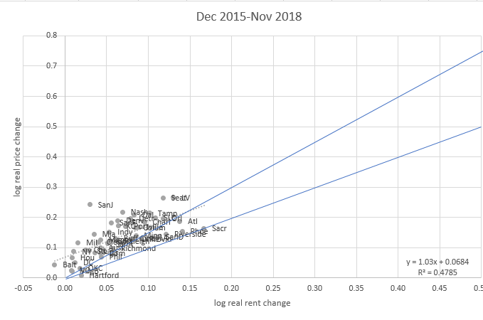
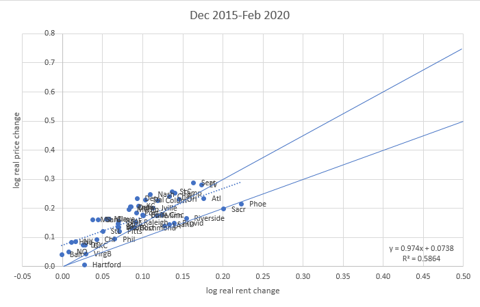
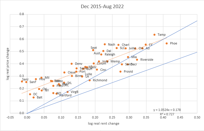
Here are three charts similar to Figure 3, for periods starting in December 2015. In December 2015, mortgage rates were about 4%, went up to 4.9% by November 2018, down to 3.5% by February 2020, and are now in the 6-7% range. All three figures basically look the same as Figure 3. They look as if there is a 1:1 price/rent relationship with an added price boost of a few percentage points, first 7 points when rents were rising with rising interest rates and a growing economy, then the additional 11 points during the covid period that coincided with various demand and supply shocks and (until recently) lower rates.
I suspect there are a number of things going on here, pushing up the left end of the line. Possibly some continued price recovery in affordable, low growth cities that had especially been hit by the credit shock after 2007. Probably expectations of future rent recovery in expensive cities that had temporary Covid-related outmigration. There is some question about how permanent that outmigration will be, and I don’t have any insight there. Building rates in those cities are so low, though, that I don’t think it takes a very strong point of view to expect a return to rising rents eventually, and so temporarily higher price/rent trends seem reasonable.
A couple points:
While, I suppose, one could still associate some of the post-Covid 12% price boost to interest rates, or some other form of stimulus, the fact of the matter is that the increase in relative prices just doesn’t map that well to changing rates. Neither the 2015-2018 nor the 2018-2020 period confirms any interest rate effect. It’s easy to defend, because it comports with standard financial theory. But, you have to disregard at least the previous 14 years of price and interest rate experience to stick with it.
Oddly, it is the cities with the least price appreciation that appear the most overpriced. Certainly, they are, if prices are following the 1.5x feedback loop pattern. But, even if prices should just rise proportionately to rents, this would leave you little reason to expect more of a price decline in Phoenix than, say, Pittsburgh. I don’t think many are looking at it that way.
So, a top-heavy price collapse story would really need to be a rent collapse story, and so, my next question is, if rents are down 10% or 15% over the next year, do you think mortgage rates will still be at 6-7%? So, maybe there is the possibility for an interest rate “correction” or a rent “correction”, but there is little historical precedent for either, and it seems especially unlikely that we could get both.
On the other hand, if rents go down significantly and mortgage rates are back at 3% in a year, look out below. I still think it would be hard for the Fed or regulators to be destructive enough to create that scenario, but I suppose it is a scenario that could happen. Yet, here again, interest rates have such a complex role to play there, I just don’t see a point in paying them much attention. I can assure you that you won’t see countless newsletters in that scenario wondering why home prices declined while mortgage payments became so affordable with such low rates.
One last thing that I thought was a bit odd this month is that the average price change in the largest metro areas was much lower than the US median. (Oddly, generally the decline appears to be reported in west coast cities regardless of each city’s other characteristics.) The average of the metros and the US median generally are very close. The standard deviation of price changes between cities also spiked up from already high levels (left panel). On the right panel, I show the US median price change and the difference between the US median and the average of the largest metros. One of them (the US median or the metro average) was an outlier last month. I guess we’ll find out which one soon.
Below the paywall, I have data on 8 of the Erdmann Housing Tracker cities and the national data, for comparison to the rent and price trends in the charts above.
Keep reading with a 7-day free trial
Subscribe to Erdmann Housing Tracker to keep reading this post and get 7 days of free access to the full post archives.

